I had said in my 1939 Hunchback of Notre Dame review on setting, that movies shouldn’t take too much from Notre Dame’s structure as it’s changed a lot from it’s state from the time the story takes place to when Victor Hugo wrote the book to when Disney created the film.
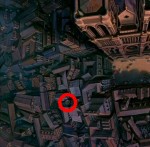
First Disney makes Notre Dame much taller than it actually is. It’s a flaw but it not something to rage over. It’s just kind of laughable large. Another flaw that can be over looked is the all the exterior sculptures on the Cathedral are shown as plain, natural-colored stone. At the time the story is set, they were polychromatic – painted in colors. Again it can be overlooked because Notre Dame current look is so iconic that it would have looked strange to audience to have colors associated with the exterior. I can also overlook the square in front of Notre Dame also that wouldn’t have been there in 1400 but you can forgive.
The aspects of the depiction that I have a hard time overlooking is the how the sanctuary is depicted. In the scheme of Hunchback cartoons and movies it’s very accurate, there are some terrible representations of Notre Dame but the way it’s set up in the film is problematic. The Sanctuary is show once in the film during “God Help the Outcast”
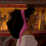
Looking at Notre Dame’s set up and structure Notre Dame seems both bigger and smaller. Esmeralda strolls though the layout a a very leisurely pace yet the Cathedral seems more expansive than it is. She also isn’t impeded by the structure. At about at the 2:00 minute mark of the song, Esmeralda is seen walking in the side aisles and to her left there are columns. Then in the very next shot, Esmeralda is against a Fresco, with no columns in the shot. Which means Esmeralda needed to veer to another side of the column but she did not. So I guess the columns magically go away for a better shot. Also if her head in level with the fresco how tall is she? Because her height is really inconsistent and she’s bare foot and those Frescos are pretty high off the ground. Then this could be inconsistency. But do make the inside of the Church not in proper proportion.
Check out this website to see what I mean;
http://www.fromparis.com/virtual-tour-notre-dame/ click around to get a visual tour of Notre Dame
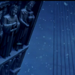
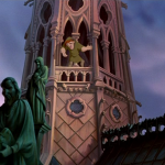
So getting back to what I said at the beginning of this about being careful not to copy Notre Dame in it current state to much is that after Victor Hugo wrote Notre Dame de Paris, the cathedral when though a massive changes. The statues that can be seen in Out There towards the end when Quasimodo talks “Ordinary Men” where add after the novel was written in 1831. Those statues are 12 apostles that adorned the spire. I don’t think I would mind this but Quasimodo motions to the statues as an examples of “ordinary men” The 12 Apostles are ordinary men Disney? Really? The fact the Disney used the statues as more than just Background but a visual aid is where I find fault.
Next Time – Major Differences between Disney and the Book




Edit. I meant they ONLY used popular opinion to base how they will make a sequel or spin off instead of actually reading constructive reviews explaining parts that are good and bad.
I LOVED the 2 statues. If it weren’t for them the movie wouldn’t be so funny. It’s not suppose to be exactly like the book as it’s a kids……correction. I mean a family movie which the whole family can watch.
The darker themes that are already in it surprise me for a Disney movie but then again all franchises have their black sheep which wind up not going anywhere because companies use popular opinion then look for constructive reviews to see HOW people liked these films and what can be improved/removed later.
I bet they DIDN’T do that in the sequel which is why it feels more watered down. I loved how this movie has some action but isn’t so fast paced you can’t see who is fighting who.
Most modern movies the fighting is so fast you can’t tell what’s really going on until afterwards and you wonder how so and so died or got seriously wounded.
The first Disney Films seem to have kept an even pace in action while newer ones feel tacked on and the artwork isn’t as detailed.
Take Lady And The Tramp for example.
The first film Dad and I were noticing all sorts of design details on the doors,walls,ceiling.etc like the scene at *Mario’s* where he played *Bella Notte* the kitchen has so much detail in the background shot most other companies simply wouldn’t bother with.