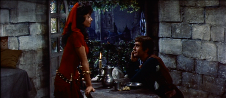
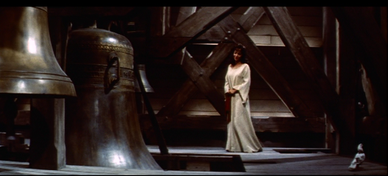
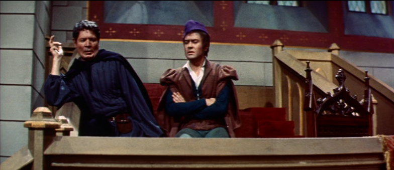
Unlike other versions of The Hunchback of Notre Dame I can tell I’m looking at a set in the 1956 version. The sets are nice and they do their job well but there is no life to them. That maybe the fault of the film’s direction and not entirely the sets themselves.
Notre Dame itself looks fine. It has a nice sense of age and weathering on it. But you never see the full grandeur of it. You get hints of it in shots of the city but nothing expansive.
You do get a sense of the narrow poky streets of medieval Paris but with the flat angles of the direction of this movie the sets really just sit in the background and do not get a sense of feeling like I have been transported back in time I feel like I’m looking at decent looking sets.
I had there been more style to way this film was shot maybe the sets would have stood out more and felt less fake. I feel like the sets were designed for Disney’s Epcot Medieval Paris Experience*” and not a movie.
Next Time – The style of this movie i.e. The Direction
(*) This totally should exist


