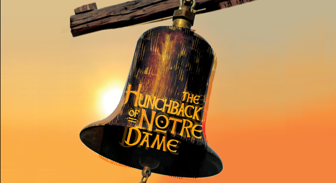
These are the two posters from the Stage production of the Disney version of the Hunchback of Notre Dame. A note, the poster for La Jolla is used on their website and it may not be the official poster.
One is from the German version Der Glöckner von Notre Dame and the other is the poster from the upcoming La Jolla English language version.
Both posters are quite different. While both do have bells imagery Glöckner’s only hints at one while La Jolla’s makes it a focal point.
Glöckner’s simplified Quasimodo gives the illusion that the show could have an upbeat tone but its lack of color does add a flavor of melancholy. I reviewed the show but I have not seen it but the show is bright and colorful but does have a sad ending. The square and vertical text work echos Notre Dame in a way. Otherall the poster is simple yet interesting.
Where the Glöckner’s poster used a cool purple and black gradient for it overall color, La Jolla is the opposite, opting for a warm yellow tone. While the color yellow is typically cheery and bright this poster seems to have a shade of sadness. It’s a bell on a wooden bean with the logo on the bell. Behind is a setting sun. Setting suns usually indicate death. Moreover the lines on the bell and the wood make it look old and broken. There is no characters on it just the bell.
I like both posters in different ways. I like the singular bell of the La Jolla poster and I like the sad little Quasimodo figure. Both are very simple and that is their strength. If I had say what I dislike about them I would I say I don’t really like the shadow on Glöckner’s and I think the glow on the sun is too strong and white on the La Jolla poster.
Which poster do you like better, Glöckner or La Jolla?


I don’t think I’ll ever be a fan of Der Glöckner’s poster, primarily because the font is just so…grungy. It looks as if it were carved in a tree in a remote jungle somewhere. It just seems like a really a odd choice to represent a story revolving around Notre Dame with its neat, structured architecture. I also don’t like the red or the crudely drawn Quasimodo doodle, but I do like the blue and black gradient in the background as it gives it a very somber feel.
I’m not so sure I like La Jolla’s poster too much, either. I think it’s a just a little bit too simple. Personally, I think that any of the poster art concepts by the late John Alvin would work better for the stage production: http://www.johnalvinart.com/ProductionDetail.aspx?ProductionId=44
My personal favorites are this these: https://31.media.tumblr.com/tumblr_lqg9dbKGpV1qe1wk7o5_500.jpg
http://www.vintagemovieposters.com.au/wp-content/uploads/2012/07/the-hunchback-of-notre-dame-1996.jpg