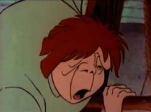
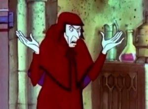
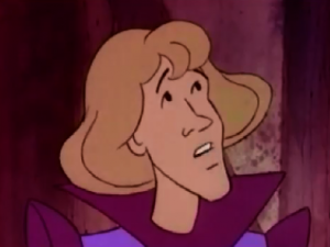
What can you say about the animation in the 1986 version of the Hunchback of Notre Dame, it’s bad. Much like the character design it’s dull and uninspired.
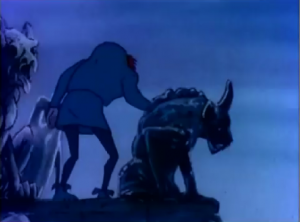
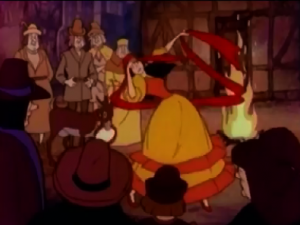
The first scene is this cool moody shot of Quasimoodo with gargoyles and if the rest of the movie followed in vein of cool gothic-ness it would have been awesome but since we have already discuss that Burbank Films Australia was about efficiency than style, the look of the thing is dashed in less than a minute when we see Esmeralda awkwardly twirling in warm yet dull colors. The colors design in this was just a bad choice, nothing is vibrate or alive, it just looks lifeless.
Another factor of efficient style is the lack of full-legenth shots and movement. Most of the movie is taken in the 3/4 shots or close up. The staging and composition of scenes just get boring as it’s typically one character talking insolation in a 3/4 shot to another character in a 3/4 shot.
I will say that this version is less unabashed in laziness than the Enchanted Tales version but I think it was far less ambitious, in that way I respect this version more. Oh, it has its methods for padding things out, like letting 48 frames go by of nothing, just stillness, periodically throughout the movie.
I feel like a broken record saying that the execution on this movie’s animation is dull and boring but that the truth of it. If the animation was even slightly better this would be held in higher esteem but the real sad truth of the matter if they had put any more effort in to this movie they wouldn’t have had follow the book as faithfully as the did.
Next time- Accuracy and Laziness

