Compared to other musicals in the world, Notre Dame de Paris is VERY minimal for something that is marketed as a spectacle. As far as sets, set pieces and props, there isn’t really much going on in the show.
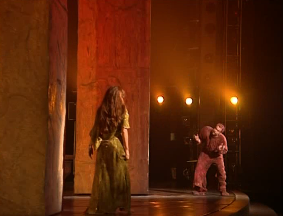
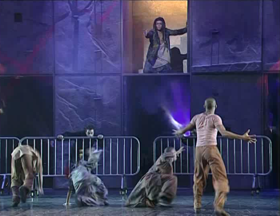
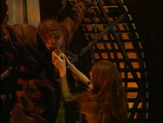
The bulk of the set is really just a rock climbing wall that fills in for Notre Dame as well as some pillars that help sell the set as the cathedral when the scene demands. This puts a heavy burden on the lightening to change the scene as well as the mood.
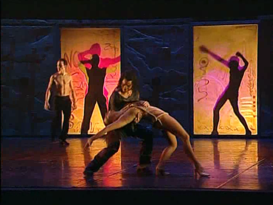
I won’t pretend I’m a lighting wizard who knows about filters and gels and what not, my experience in the theater ended in 8th grade and my teachers didn’t teach the students anything of backstage tech or even acting methods but Notre Dame de Paris does some great things with the lighting. It’s moody when it needs to be and warm and bright to communicate the outside. It has some nice patterns of cobblestone and rose windows. I don’t think that is too complex of an effect but it’s a nice touch throughout the show.
Then there is the dancing and acrobatics which is probably where most of the marketed “spectacle” lives. The dancing is sort of a mixed bag in terms of conception because without it the show is less a musical and more of a glorified concert but at some points it gets in the way of the show.
Not too often does the dancing do this but at some points it’s overkill, though I will admit that could a side effect of the editing on the DVD. I mean it’s not like I can just go to a place whenever and see the show, it hasn’t been in North American since 2005 and only has been performed in my country for one cast run in 2000 for six months. Am I bitter? Yes!
This post has gotten away from me. Anyway the staging, it’s fine for what it is, stylized minimalism.


