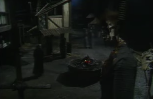
Set from 1977 Hunchback of Notre Dame
Perhaps it’s mean to really be that judgmental towards the sets in this version of Hunchback. After all this is a BBC made for TV two part miniseries from the late 70’s, and based just on the look and the fact that they used a painting for exterior shots of Notre Dame, it points to them just not have any budget for sets.

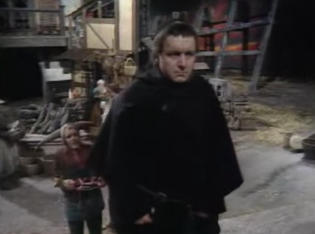
Kenneth Haigh as Frollo
As it stands this movie looks like it was shot on a single soundstage that was dressed to fit the scene, more like a play but necessity is the mother of invention so we can and will judge like the cold-hearted judgmental bitch critic we wish we were. Honestly, I started out this review wanting to go easy on this movie for its sets but then I watched it again.

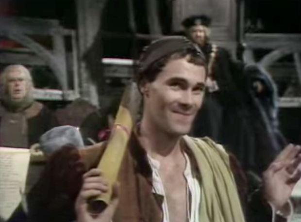
David Rintoul as Jehan
The sets are a awash of dull dark browns and ashy grays. There is not much color to these sets. This could be an attempt to showcase the urbaness of medieval Paris but just comes off as boring, like the rest of the movie and what this reviews series as devalued into. How many ways can I articulate this movie is dull? Turns out I don’t need to the sets do it for me.

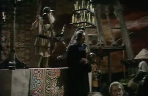
Set from 1977 Hunchback of Notre Dame
Let’s look at the first set of the movie, the place where Gringoire has his play performed, it a stage with a carpet on it, some chairs, some candles holder and what look like stone frames. The walls, or a dropcloth, which are really far back are painted in red tones. Now I always assumed that this was an interior BUT now that I look at the set and consider it more this is supposed to outside space given the red background and the stone frame things. But given that I just can’t really tell, how effective is this set at conveying the where this scene takes place?

Hetty Baynes as Fleur de Lys with Richard Morant as Phoebus
I don’t think the sets are badly made, they look like they were well executed and they look competently constructed but given how dark everything looks and that the lighting isn’t helping you can’t really tell. Everything just fades into mediocrity.
