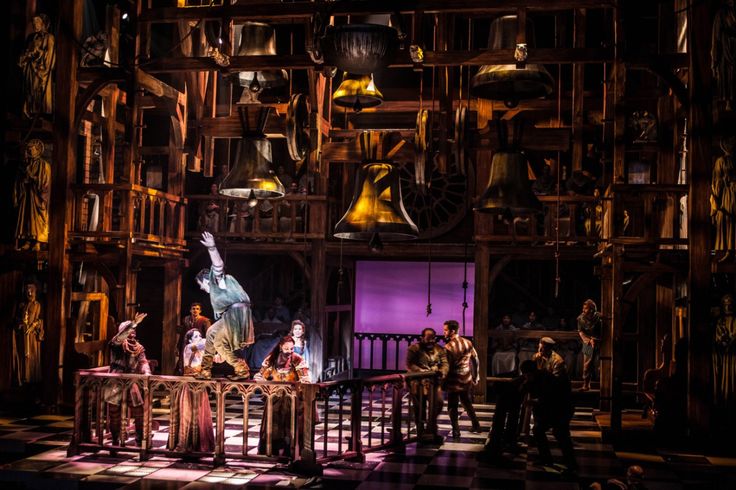
Hunchback of Notre Dame Set
I have a bit of a confession to make, I really wrote myself into a little corner with this post as originally I had planned to discuss the Gargoyles VS the chorus but I just did that in a more organic fashion last week and I don’t what to be knowingly redundant. After looking through the production, I found my muse, one Alexander Dodge.
Alexander Dodge was the set designer for the American production of the Disney Musical. His other work include, The Tempest, Ghost of Versailles and Anastasia for the Hartford Stage. Anastasia is based on the Don Bluthe movie and is going to Broadway. You can check his work here which is gorgeous.
The Hunchback set is lovely. It does a good job of basically simplifying the cathedral into its main parts os action but working upwards. The floor represent the Sanctuary, the Rose window and the Statues the Middle portions and the bells for the Bell Tower. It’s not hard to understand. Places outside of Notre Dame are communicated more with set pieces and lightening.
I feel like there is a large disconnect between the vision of the musical trying to slightly minimal with Quisimodo’s deformity and the extras filling in as set pieces with the grand vastness of the set. For instance when Quasimodo is saving Esmeralda, he goes through the Gallery of Kings. The Gallery of Kings is represented with the Extras but they are also part of the set on the sides. It would have been confusing to an average viewer and the set could have allowed for that. I guess because the extras go back and forth between the animated and stone states that their poses made it clear but I was even confused for a second.
Overall the sets were not so much the issue the vision of the production was problematic. Also a lot of the time it was hard to even see the set through all the moving parts, i.e the set pieces and the extras.
