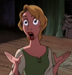
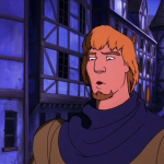
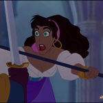
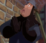
We’re discussing the Production Values in this post.

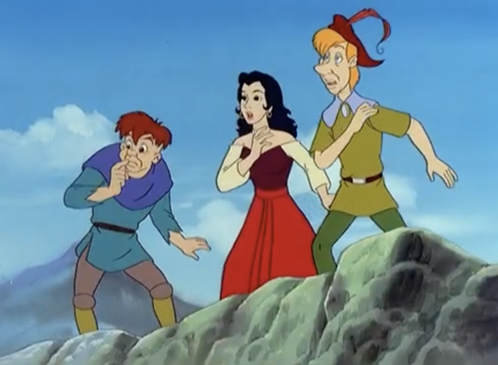
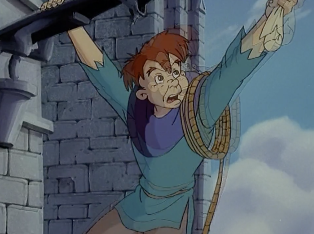
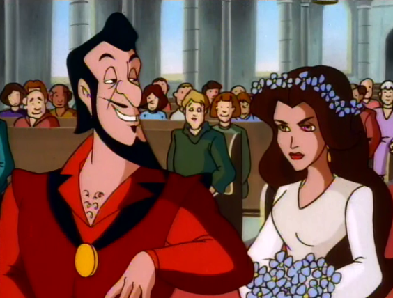
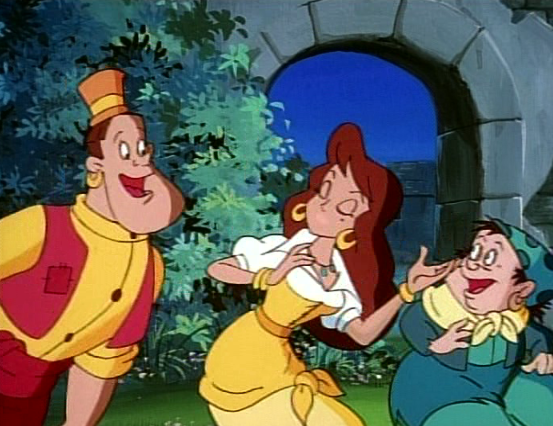
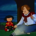
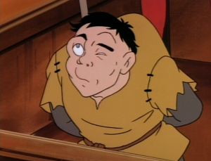
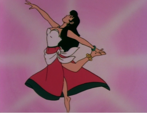
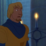
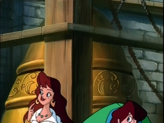
Quasimodo, Esmeralda, François, The Magical Adventures of Quasimodo Episode 10

Production Values refers to the technical merits of a production. So in terms of animation, it would mean the character design, background design, the style and the quality of animation, music, voice acting, etc.

The Magical Adventures of Quasimodo was produced by Arès Films, CinéGroupeTélé-Images, and Astral Media. CinéGroupe and Astral Media are Canadian companies while Arès Films and Télé-Images are French companies. Arès Films, CinéGroupe and Télé-Images were on the animation production side of the industry while Astral Media was a media conglomerate.  

Perhaps if you grew up with shows produced by these companies you would be more familiar with them and their “notable” shows/films. According to their wiki,  CinéGroupe’s most notable productions were The Kids from Room 402, What’s with Andy?, and Pig City.  Of those three, The Kids from Room 402 rings a bells for me but I’m not 100% sure if I recall it. They also did the sequel to Heavy Metal, Heavy Metal 2000 but for me that just name recognition. As for Télé-Images, they did Highlander: The Animated Series and again that sounds vaguely familiar to me but I could just be remembering the name of the older show and not the animated show.  

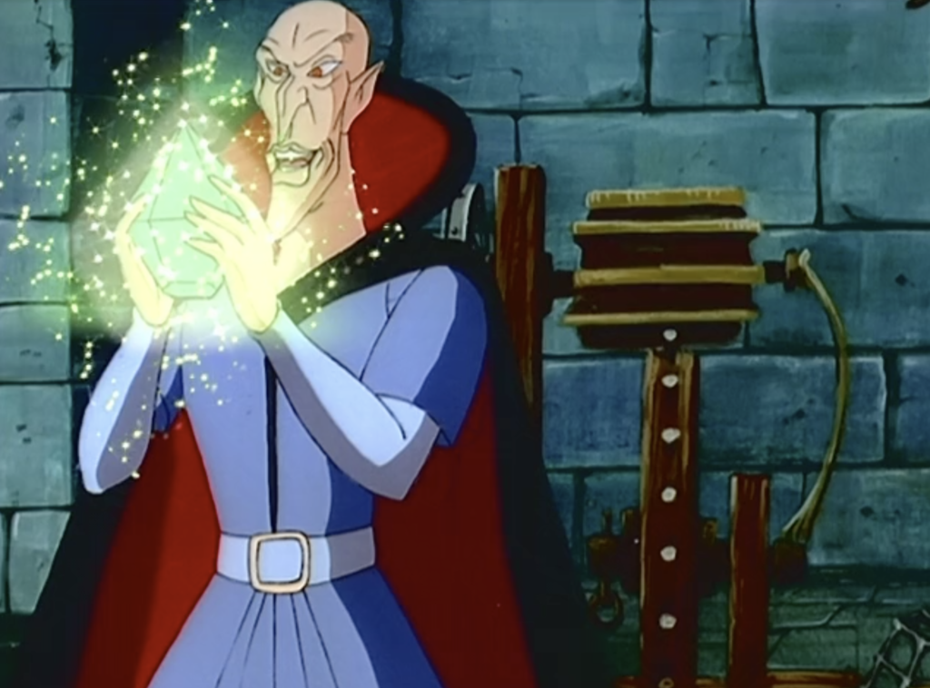
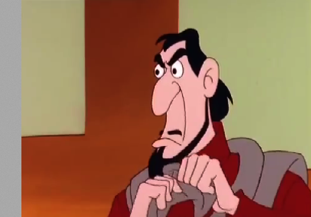
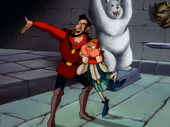
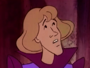
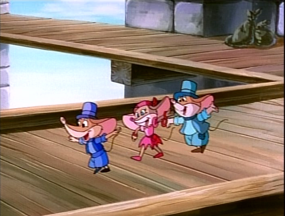
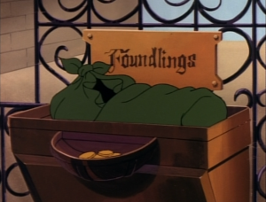
Frollo with the Philosopher's Stone, The Magical Adventures of Quasimodo, Episode 23, The Treasure
Frollo with the Philosopher’s Stone, Episode 23, The Treasure

What does all the mean for The Magical Adventures of Quasimodo? All it really means is that the studios who produced it did not have widespread cultural reach. Not saying they were not known in their own countries or not successful, they were just not titans of industry. Which is fine.

However production can not happen without financing. According to the credits the financial participants were with Telefilm Canada, the Government of Quebec, and Centre National de la Cinématograohie (France.) All of these are state-funded agencies. 

I do not know what the production budget was for The Magical Adventures of Quasimodo. I couldn’t find any info. It might be behind the paywall of imdbpro. However considering the show was financed either fully or in-part by public-funded agencies, I would wildly speculate that the budget for The Magical Adventures of Quasimodo wasn’t exorbitant but it doesn’t appear to be shoe-string either. It was 26 episodes which are mostly consistently produced across the board. In looking through the credits it appears that the animation was not outsourced to a cheaper studio to do in-between frames, which I think is a fairly typical practice. Not outsourcing would have impacted the over-all budget. 

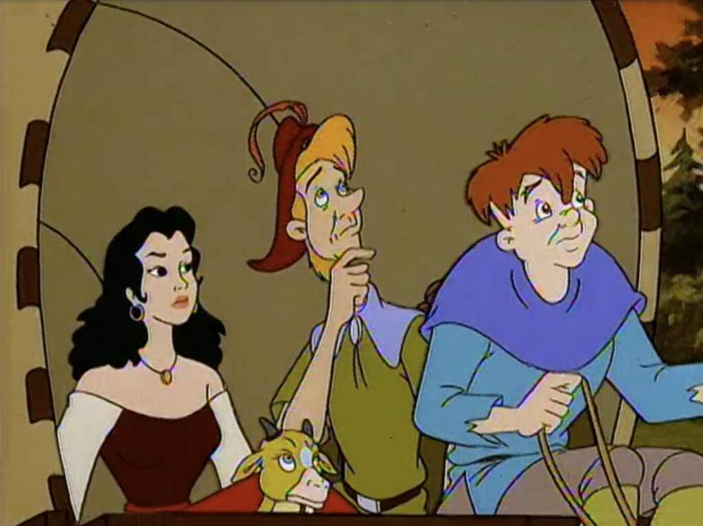
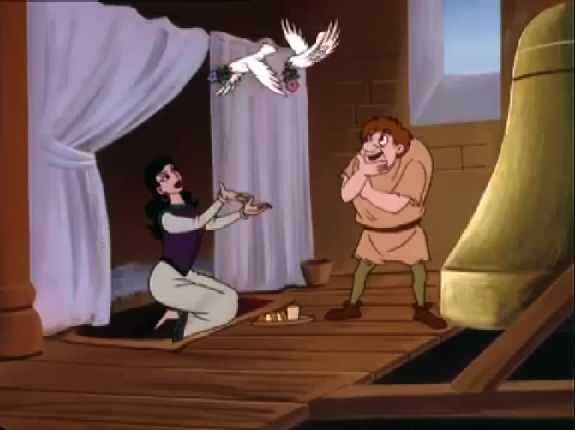
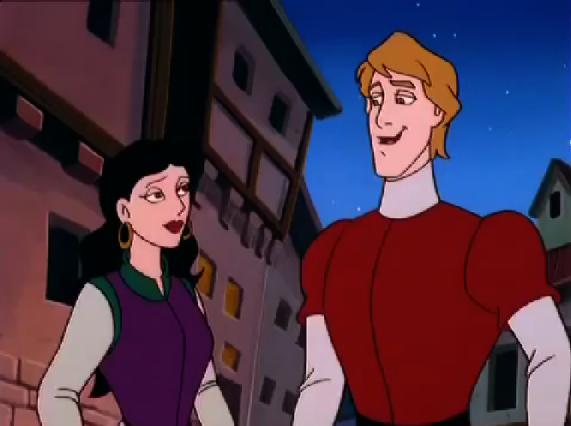
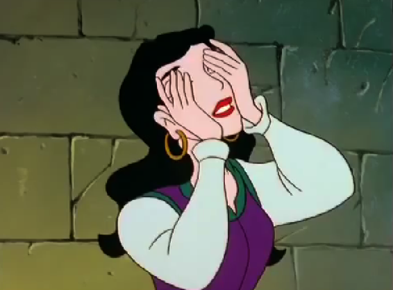
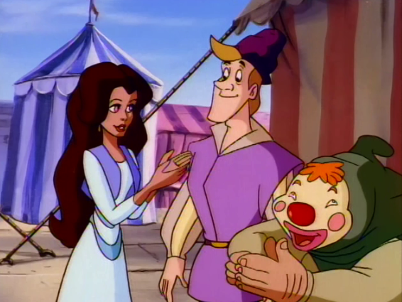
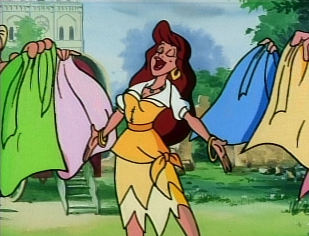
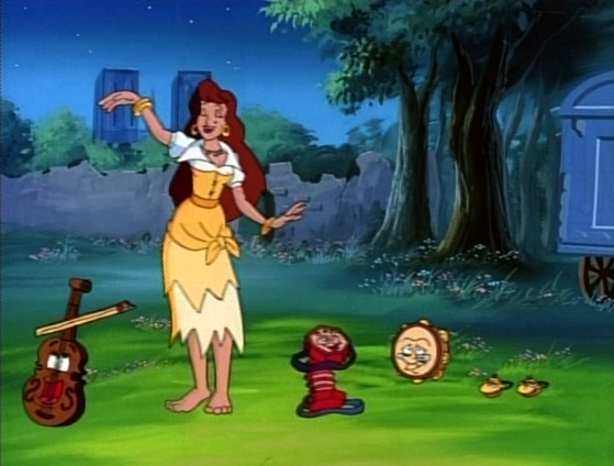
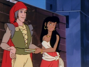
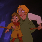
The Magical Adventures of Quasimodo, Esmeralda, François, Quasimodo, Episode 15 The Beast
Esmeralda, François, Quasimodo, Episode 15 The Beast

I do think that there was a couple hundred grand spent on this show which means a modest to average budget for a 26 episode show which also includes the writing, editing, pre-production etc. There is nothing about the production values that were overtly awful but also nothing amazing. The story and the over-all concept are more “interesting” than the character designs/ setting but again they are fine, very serviceable with getting the point and characters across to the viewer.     

I think it would be easy to wave this show off as just another kid’s show from the mid-90s and therefore it just par-for-the-course that it was so averagely produced. But there were quite a few kids shows at the time that were pushing the envelope in terms of stories and animation that it would be disingenuous to those productions. However though shows probably had more of a budget and/or name recognition behind the production.     

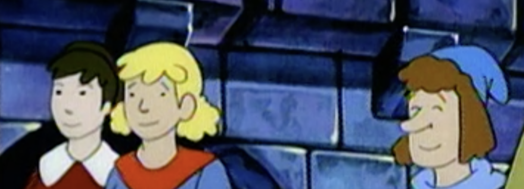
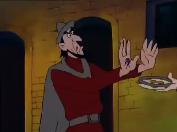
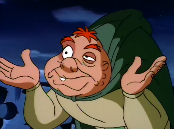
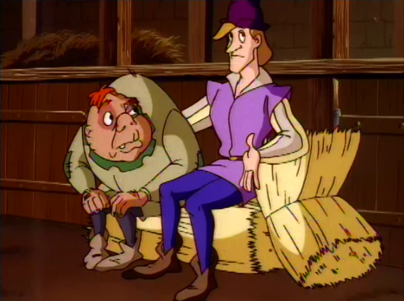
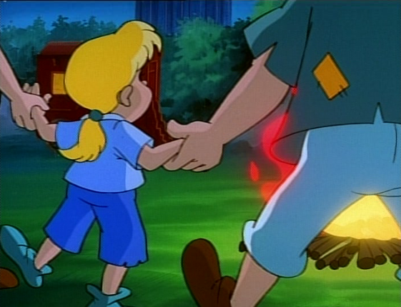
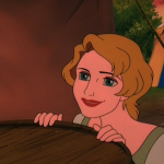
The Magical Adventures of Quasimodo Background extra, Episode 15, The Beast
Background extras

On a scale of Disney’s Hunchback to the Dingo Production, Magical Adventures falls somewhere is towards middle of the spectrum. It’s not a total trash piece but it’s by no means an example of the art of animation. However I doubt the production behind The Magical Adventures of Quasimodo was trying to be anything more than a semi-decent animated TV show of the mid-90s. It’s average in its scope of its production values and I think that was the goal. 

Animation: C-
Backgrounds: C-
Character Design: C-
Music: C
Voice Acting: B-
(My opinions)

Quasimodo in action with frame-blending in The Magical Adventures of Quasimodo, Episode 21
Quasimodo in action with frame-blending

Also I just want to mention that show’s quality of the animation that is available on streaming sites is at disadvantage. This due to the conversion process to covert film to digital which means there are frame-rate issues resulting in frame blending, rainbowing, and artifacts. The show is free so I don’t think much effort was put into the conversion other that to get it in a digital format. So any moments that MIGHT have had good fluid animation, like action scenes, suffer a bit. But at least it is available to watch and not lost to time.  

Esmeralda Other Burbank Hunchback of Notre Dame picture image

Esmeralda

I feel like I’m in some weird ring of hell. A Ring of Hell where my sole torture is rewatching this version of Hunchback. I can’t tell you in how many ways I just loathe this version and it’s not even in a logical, it’s visceral, it strikes me down to my core. I hate everything about this version and it hurts my soul in so many ways that I’m not sure I can quantify anymore why it’s a puke stain on the already dirty carpet of Hunchback version aimed at children. I think the main reason I can’t articulate why it’s terrible is because it has the same problems as every other  Disney knock-off versions, at this point it’s a case of “second verse same of the first.”  Everything is just the worst but you came here to read something that in some way resembles a review or you just click on a picture or you’re lost and have already clicked away but whatever the case the subject line has spoken and it’s not even trying to be clickbait so let’s get this over with.

Esmeralda and Quasimodo, Other Burbank Hunchback of Notre Dame 1996 picture image

Esmeralda and Quasimodo,

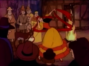
As is standard with these knock-off Disney direct to video movies the animation super low budget. The use of repeat animation for extras to pad out the run time is beyond annoying and I might not have minded it so much if the movie didn’t start that way. It takes nearly three minutes to get to Esmeralda awkwardly dancing about, three minutes of just nothing but random town’s people laughing and clapping on repeat.  In addition to animation being stilled, awkward and mostly on repeat  most of the shots are at flat angles.  There is nothing interesting or memorable about the way the shots are composed to even hold a remote sense of attention.


Frollo Other Burbank Hunchback of Notre Dame picture image

Frollo

But again I’m not done, though I wish I was, this will never end. There is the color design of this thing. If you think I was joking about calling this movie being like puke you were wrong. The color this movie most likes to use is a weird dark yellow color that resembles vomit. They also use a  green that looks like another shade of puke. I’m not kidding this movie has an ugly and all-round unpleasant color palette. If they were trying I guess they were trying to make it warm but they failed, they failed hard.

Esmeralda meets Phoebus Other Burbank Hunchback of Notre Dame picture image

Esmeralda meets Phoebus

Then there is the character design. Can you believe I didn’t really touch in the character designs yet? Both Phoebus and Esmeralda are drawn to be the prettiest that the shitty animation will allow. This of course gives them no visual interest so being “beautiful” by this movie’s standard is a mute point. Though the best line in this movie is Frollo describing Esmeralda’s eyes as “shining brighter than the most beautiful stars in the night sky.”  Too bad they don’t.

Quasimodo Other Burbank Hunchback of Notre Dame picture image

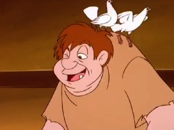
Quasimodo with his doves

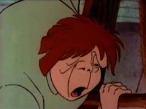
Quasimodo is your typical cute, nice, deformed design that you see over and over again. He is very bulbous and round making him “cute.” Which is like standard in character design round is good and angles are bad.

Frollo Other Burbank Hunchback of Notre Dame picture image

Frollo

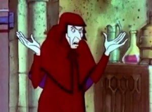
Speaking of angles there is Frollo. And he is yet another case of “second verse same as the first. Agian he looks like a mix of Disney Gaston and Jafar. Why? Who are they even coping at this point? This  is like the third Frollo to look like this? He doesn’t look like either Disney Frollo or the 1939 version.  Is this a case of parallel thought between three stupid Disney Knock-off versions, where they combined  two popular Disney villains or did this version copy Secret of the Hunchback of Enchanted Tales? Both options scream laziness.  Though to be fair this version did take Frollo’s design beyond merely combining Gaston and Jafar and instead cross that combination with a fish.   


Esmeralda Other Burbank Hunchback of Notre Dame picture image

Esmeralda

This version is just entirely forgettable with its abysmal animation, boring flat angles, cringe-inducing color palette and lazy character design.  The only thing I can recall about this movie is how forgettable this version is and that is why I have to rewatch it thus prolonging the torture of the ring of hell I now occupy.

Quasimodo is just being Quasi The Secret of the Hunchback picture image

Quasimodo is just being Quasi

So here we are again, discussing other low budget cash grab off Disney’s Hunchback that has character designs that are derivative to Disney’s Beauty and the Beast as well Aladdin. It would be hilarious if it wasn’t so pathetic.

Frollo and Esmeralda's wedding The Secret of the Hunchback picture image

Frollo and Esmeralda’s wedding

Compared to the Enchanted Tales version, the character design in this version is marginally more preferable. At least with this version’s Quasimodo isn’t some sad pretty boy, he looks as Quasimodo should look even if his hunch is angel wings. The other characters look their parts except Frollo who as I have mention before on his character review looks like Gaston and Jafar’s love child. Gotta wonder if they read the book or at least watched the 1939 version, my guess is no to both.

Esmeralda with Pierre and masked Quasimodo The Secret of the Hunchback picture image

Esmeralda with Pierre and masked Quasimodo

Also the character design in this version as compared to Enchanted Tales looks more cartoon-y, as in they went for more humorous designs instead of trying to make the characters pretty, and failed. Given the humor and how the Enchanted Tales version is misguided and stupid, the  humorous goofy look is better but on the whole the designs are not good.

Frollo and his goon The Secret of the Hunchback picture image

Frollo and his goon

As far as the animation goes, there are Hunchback versions that at worse, so much worse, like hellishly worse and of course on the other end there is Disney movie.  The  Secret of the Hunchback looks more akin to a low-budget saturday morning cartoon. It’s fine giving the amount of money and effort they put in but no one is watching it for its art style.

Quasimodo and Pierre The Secret of the Hunchback picture image

Quasimodo and Pierre

There is nothing special about The Secret of the Hunchback’s look and animation. It’s passable but only barley.

Quasimodo 1986 Hunchback Notre Dame picture image

Quasimodo

What can you say about the animation in the 1986 version of the Hunchback of Notre Dame, it’s bad. Much like the character design it’s dull and uninspired.

Esmeralda Dancing 1986 Hunchback Notre Dame picture image

Esmeralda Dancing

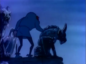
The first scene is this cool moody shot of Quasimoodo with gargoyles and if the rest of the movie followed in vein of cool gothic-ness it would have been awesome but since we have already discuss that Burbank Films Australia was about efficiency than style, the look of the thing is dashed in less than a minute when we see Esmeralda awkwardly twirling in warm yet dull colors. The colors design in this was just a bad choice, nothing is vibrate or alive, it just looks lifeless.

Quasimodo 1986 Hunchback Notre Dame picture image

Quasimodo

Another factor of efficient style is the lack of full-legenth shots and movement. Most of the movie is taken in the 3/4 shots or close up. The staging and composition of scenes just get boring as it’s typically one character talking insolation in a 3/4 shot to another character in a 3/4 shot.

Frollo 1986 Hunchback Notre Dame picture image

Frollo

I will say that this version is less unabashed in laziness than the Enchanted Tales version but I think it was far less ambitious, in that way I respect this version more. Oh, it has its methods for padding things out, like letting 48 frames go by of nothing, just stillness, periodically throughout the movie.

Gringoire 1986 Hunchback Notre Dame picture image

Gringoire

I feel like a broken record saying that the execution on this movie’s animation is dull and boring but that the truth of it. If the animation was even slightly better this would be held in higher esteem but the real sad truth of the matter if they had put any more effort in to this movie they wouldn’t have had follow the book as faithfully as the did.

Next time- Accuracy and Laziness

Esmeralda and Quasimodo at the Pillory 1986 the Hunchback of Notre Dame picture image

Esmeralda and Quasimodo at the Pillory

Melody sings Enchanted Tales Hunchback of Notre Dame picture image

Melody sings

We have seen a lot of bad animation here on theHunchBlog. From the Disney sequel, to Jetlag, to even that episode of Madeline, we have seen some real examples of clunky, amateur animation but as far as awful, crapped-filled, poo animation goes, the Enchanted Tales Version of The Hunchback of Notre Dame takes the cake.

disappearing hinge Enchanted Tales Hunchback of Notre Dame picture image

Disappearing hinge, it also repeated twice

The animation is so bad but what makes it bad? I will tell you one thing, re-watching this while trying to pay extra close attention to the animation made my brain literally melt out of my eyes and ears. My still being alive is no doubt some sort a cruel miracle.

Melody dancing with the annoying is repeated at the beginning and end Enchanted Tales Hunchback of Notre Dame picture image

Melody dancing with the annoying is repeated at the beginning and end

Well the least offensive thing is the repeating animation. Repeating animation in it of itself isn’t the problem, many movies repeat animation, it’s money saving. The problem is the frequency and how blatant the repetitions are and this pile-of shit repeats animation like nobodies business.

Circle dance animation Enchanted Tales Hunchback of Notre Dame picture image

Circle dance animation

Those kids doing the circle dance is repeated back and forth, back and forth a total of 3 times in the first minute alone. Oh, it gets repeated more but 3 times in the first minute that is just insane and it wasn’t that great of animation to start, it’s just random people with their backs to camera kicking in a dance circle.

The background is being repeated endlessly Enchanted Tales Hunchback of Notre Dame picture image

The background is being repeated endlessly

They also steamboat willy a lot.

Pierre is on and off the horse Enchanted Tales Hunchback of Notre Dame picture image picture image

Pierre is on and off the horse

At roughly the 5:10 mark, Pierre and Frollo are on horses trying to find Melody and they repeat animation from earlier of Pierre and Frollo saying “no” to each other. Problem is Pierre is clearly on the ground and not on the horse during the repeating animation. Such pain!

Enchanted Tales Hunchback of Notre Dame picture image

is it day or night?

As if that was bad, the movie start off with huge night/day confusion. Frollo and Pierre at talking and it’s supposed to be night out I think because Frollo says “after dark” but it’s daylight in the scene. Then it’s night as Melody dances but at one point the scene shifts to the accursed Dingbats and it fucking daytime and then night again. Hey movie, ever hear the word, consistently? No? Didn’t think so. Argh this movie

Why are they made, the dialogue doesn't match Enchanted Tales Hunchback of Notre Dame picture image

Why are they mad, the dialogue doesn’t match

And then there is the lips sync. At point you kind of have to wonder, was this dubbed? Because it looks like it could have been. As at some points the animation doesn’t match the audio. Like for example the accordion is shown getting huffy but nothing is the dilouge would suggest reasons.

Melody's mouth is gone, This has not been altered, this native in the movie Enchanted Tales Hunchback of Notre Dame picture image

Melody’s mouth is gone, This has not been altered, this native in the movie

Even if the lip sync was originally for english Melody’s mouth disappearing for a frame is inexcusable because you might not have seen it but your brain did.

Melody's mouth looks weird here because it's moving oddly Enchanted Tales Hunchback of Notre Dame picture image

Melody’s mouth looks weird here because it’s moving oddly

Their mouths also jerk around like crazy here.

Random Mice Enchanted Tales Hunchback of Notre Dame picture image

Random Mice

Aside from just the overall crappiness of the execution with its repetitions and still frames and bad lip sync, the animation on the whole of the Enchanted Tales version of The Hunchback of Notre Dame is down right insulting. It’s just down-right dumb looking and it make you dumber just looking at it. F-, 1/4 a star rating, 100 thumbs down.

Next Time – The Pacing, it also sucks!

Jean-Claude capturing Melody Enchanted Tales Hunchback of Notre Dame picture image

Jean-Claude capturing Melody


The Animation in Madeline is crap-poo. No, actually it’s worse. It’s not even bad enough to be delightful. No, it’s honest-to-god poo. But what makes it so bad besides every damn thing? Well, I will list three things because anymore analysis on this, is going to drive me to insanity.


#1 The Colors

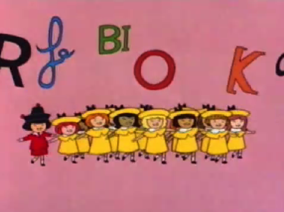
Madeline, Pepito and her friends read Hunchback of Notre Dame picture image

Madeline, Pepito and her friends read Hunchback of Notre Dame


The Color design is dull. It tries to be bright and colorful but it meanders  in the dull. Honestly I could take the colors  as the tones aren’t awful and the gradient are ok but the  dumb character design ruin it,  which brings me to me second point;


#2 The Character Design

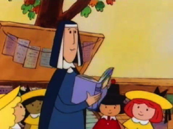
Ms. Cavell holding The Hunchback of Notre Dame, Madeline and the Hunchback picture image

Ms. Cavell holding The Hunchback of Notre Dame


The Character Designs are flat, uninteresting and dumb. Sure they look like the books but while the books were endearing the character look stupid. With their cold soul-less black dot eyes, their blocky bodies  and there unvaried faces. They just look stupid in motion. Then we come to the problem real issue;


#3 The Laziness


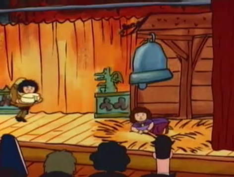
Madeline or Pepito as Quasimodo  picture image

Madeline or Pepito as Quasimodo

The animation in Madeline is abject, unfiltered, pure  laziness.  Anything that could be good and endearing is trashed by the immense awfulness of the animation. The character’s motion are stilted and awkward. The repeat animation is laughable. The use Pepito as Madeline in a long shot which make it a continuity error. I’m sure this show has a LOT of them. There are dozen upon dozen still frames to pad out the ghastly time. They also you a dissolve transition to get the girls to turn at the end while they are brushing their teeth. Also that is another continuity error since it has the girls in their “magnificent” day clothes but the shot before that they were in their nightgowns. So much laziness in this show.
 

Madeline and her dumb song hunchback of Notre dame

Madeline and her dumb song

The animation in Madeline is one of it’s biggest failures. it hard to really get passed the crappy animation. I mean one could if the story and characters were interesting but they are not so the bad animation is really inexcusable.  It really is just crap-poo.


Next time – The Moral of the Story

Pepito and Gerald Dippetty Doo, Madeline and the Hunchback picture image

Pepito and Gerald Dippetty Doo

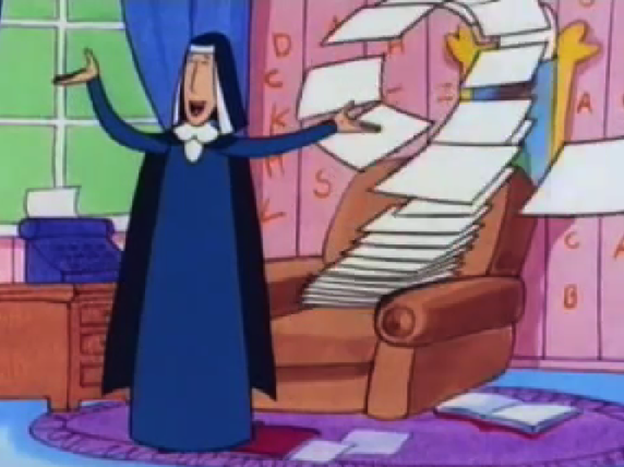
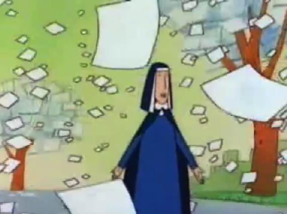
Ms Cavell and Floating paper in the Madeline and the Hunchback of Notre Dame  Song picture image

Ms Cavell and Floating paper

In the Madeline Hunchback episode, Ms. Cavell is trying to get the little girls into reading and writing. She takes them all over Paris and finally at the 6 minute mark, she introduces us to the Hunchback of Notre Dame, which is one of her favorites book. You would think after introducing the book they would talk about it a little bit, but no as soon as she spits out the title the song starts.

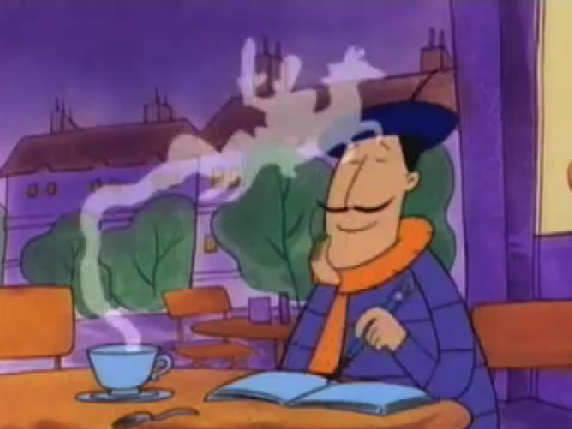
Some Guy and with a horse made of Steam, Madeline and the Hunchback of Notre Dame  Song picture image

Some Guy and with a horse made of Steam,

Madeline episodes alway have a song in them regardless if it works or not. So you might think that the song would relate to the Hunchback or Notre Dame but no. The song is about writing and how Great Paris is for writers.

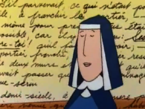
Ms Cavell and a French Poem, Madeline and the Hunchback of Notre Dame  Song picture image

Ms Cavell and a French Poem

Considering writing is the overarching theme in this, it’s not a bad thing. What is a bad thing is that is the worst thing ever created by a human. A fair warning, this song has been known to kill people because it causes uncontrollable bleeding in the ears.

Madeline and her dumb song picture image

Madeline and her dumb song

Ms Cavell sings how Paris inspires writers. Then the girls sing the stupidest chorus ever;

                                             “Write, Write Write on the left bank.”
                                                  “Left, Left, Left of on the Right.”

I have no words for the stupidness that is those lyrics and they repeat it twice. The bulk of the song’s lyrics just repeat the same idea, Paris inspires writers. The rhymes are ok but they are not by no means great. For whatever ok-ness they might have the chorus ruins it along with instruments and the visuals.

Ms Cavell and Floating paper in the Madeline and the Hunchback of Notre Dame  Song picture image

Ms Cavell and Floating paper

The Instruments are mostly a crappy cheap electronic piano. I hear an accordion which is so french and cliche but honestly the accordion is fine. However that godforsaken electronic piano with it stupid glittery cheap sound dominates this shit-feast of song.

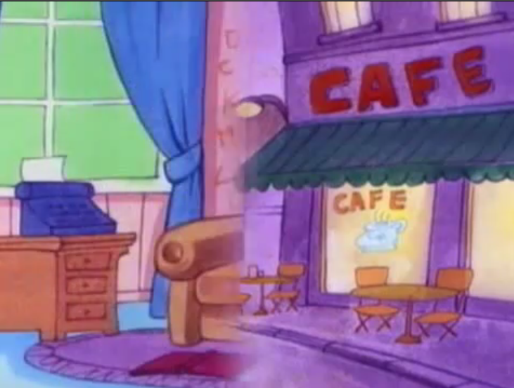
Slide Transition in the Madeline and the Hunchback of Notre Dame  Song picture image

Slide Transition during the Song

Then there are the visuals. Now I haven’t got into the animation of Madeline yet but here it is in a nutshell is what I think of it; IT FUCKING SUCKS. And my god the song portion is atrocious in the visuals.

First off let’s editing. They use fucking slide pushes. Which is a transition that pushes the clip from left right off screen. They feathered the edge to make it look soft and gentle but it looks cheesy as fuck.

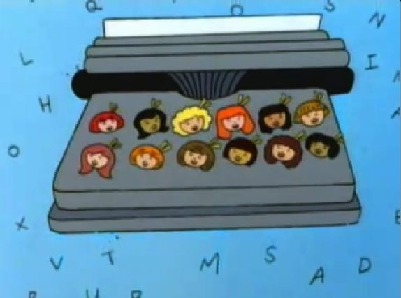
Madeline and her dumb song hunchback of Notre dame

Madeline and her dumb song

Then the little girls sing the chorus in an abstract space with letters behind them as they walk without ever going anywhere. But look their legs as the step wide. Their legs shouldn’t go that wide without their torso going down. I know this trivial but it fucking bothers me. It also looks like they animated one set of legs and put them on every girl including Pepito…. Pepito has girly legs.
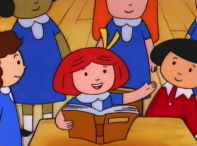
Madeline and her dumb song picture image

Madeline and her dumb song

It’s just laziness. But that is what the Madeline show is, Laziness, un-bashed and unapologetic laziness. Thankfully because it so fucking lazy the song is short. But even it’s length can’t help it from being the most awful song ever. Quickly, let me listen to I’d stick with you from the Disney Hunchback sequel. (listens to it) Ahhhhhhh….. way better.

Next Time; Let’s Complain about the Animation More….. (cries)

Madeline as Phoebus, Madeline and the Hunchback picture image

Madeline as Phoebus

Like most of the other elements in the Jetlag version of The Hunchback of Notre Dame the animation is just lazy. But more than that it’s dull and joyless.

Quaismodo Jetlag The Hunchback of Notre Dame picture image

Quaismodo Jetlag The Hunchback of Notre Dame

First, the colors. They’re dull and muddy. If it was meant to be stylistic, it failed but I don’t think it was. I think the color story was done quickly and without much thought.

Baby Quaismodo, Jetlag Hunchback of Notre Dame   picture image

Baby Quaismodo, Jetlag Hunchback of Notre Dame

Second, the repeat animation. Quite often in this movie the animation will repeat frames of animation for what seems like an eon. It does this because it has to padded out the story. The movie also does this with still frames. The effect of this method is sheer boredom. It’s almost painful to have to sit there a watch baby Quasimodo wiggling around for a few seconds.

Esmeralda twirling, The Hunchback of Notre Dame, Jetlag picture image

Esmeralda twirling, The Hunchback of Notre Dame, Jetlag

Three, the movement of the characters. It’s awkward, weird and sort of jolty. Nothing looks smooth or fluid. Also the lip sync is bad. It gets very annoying. In fact at one point Fleur de Lys is talking but nothing in coming out of her mouth. This could be the dub cutting dialogue or repeat animation. Take your pick, either choice is the result of laziness.

Esmeralda and Gringoire Jetlag version Hunchback of Notre Dame picture image

Esmeralda and Gringoire

More than that the screen composition and framing is just really dull and not interesting to look at. It just feels lazy, rushed and joyless which just further the boredom that this movie brings on.

Tormented Frollo Jetlag Hunchback of Notre Dame picture image

Tormented Frollo Jetlag Hunchback of Notre Dame

The animation is just so soulless. There is not joy or style in it and it really makes the movie feel so much longer that 40 minutes.

Next Jetlag Article – Plot Adherence

Esmeralda & Phoebus Kiss while Frollo attacks Jetlag version Hunchback of Notre Dame picture image

Esmeralda & Phoebus Kiss while Frollo attacks


The Music in the Hunchback Sequel is bad but it’s not the worse aspect. The worse aspect is the animation and the art style. Everything is lackluster from the colors, to characters’ movements and looks. Even the in-between animation, which typically isn’t supposed to be anything spectacular, makes the characters either look deformed or derpy (pardon the meme).  It all seems like there was no joy in this project on the part of the animators, like it was something they did because they had.
Sequel in-between frames

Madeline looking scary in a in-between Frame Hunchback of Note Dame II Disney 2 Sequel picture image

Madeline looking scary in a in-between Frame of Hunchback of Note Dame II Disney

In Between Frame of Phoebus Hunchback of Notre Dame Sequel II 2 Disney picture image

In Between Frame of Phoebus Hunchback of Notre Dame II Disney

In Between Frame of Sarousch Hunchback of Notre Dame Sequel II 2 Disney picture image

In Between Frame of Sarousch Hunchback of Notre Dame II Disney


VS.

Original  in-between frame

In Between Frame of Esmeralda Hunchback of Notre Dame Disney picture image

In Between Frame of Esmeralda Hunchback of Notre Dame Disney

In Between Frame of the Oafish guard Hunchback of Notre Dame Disneye picture image

In Between Frame of the Oafish guard Hunchback of Notre Dame Disney

In Between Frame of Phoebus Hunchback of Notre Dame Disney picture image

In Between Frame of Phoebus Hunchback of Notre Dame Disney


The movie was animated by Walt Disney Animation (Japan). And as it happen that Disney Japan expertise lies in there action scenes, which is an odd pairing seeing how the climax of this movie is a woman picking up a child. No battles, no fights. No wonder the animators appear not to interested in this project, they probably wanted to get it over and done with.

Madeline saving Zephyr Sequel Hunchback of Notre Dame II Disney picture image

Madeline saving Zephyr Hunchback of Notre Dame II Disney

I think the animation is one of the biggest problems with this movie along with many of the other Direct to release Disney movies. If a movie is terrible you can forgive it if it’s pretty, but if it lacks any redeemable qualities how can people like it? Actually there is a question, Does the Sequel have any redeemable qualities that makes it enjoyable? People may argue Quasimodo and Madeline finding love, but is the love interesting and good?


Next Time -Let’s answer that question. L’histoire d’amour de Quasimodo et de Madeline

Quasimodo Creepy Look Hunchback of Notre Dame Sequel 2 II picture image

Quasimodo Creepy Look Hunchback of Notre Dame II

Madeline looking weird Hunchback of  Notre Dame II  Disney Sequel 2 picture image

Madeline looking weird Hunchback of Notre Dame II Disney


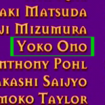
Special Bonus Picture;

This is joke, Yoko and Ono are common Japanese names…just thought it was a little funny that a Yoko Ono worked on the movie.

Sequel Animators Feature one Yoko Ono picture image

Sequel Animators Feature one Yoko Ono