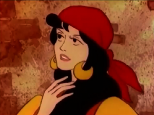
1986 Esmeralda
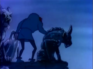
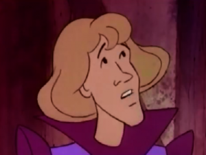
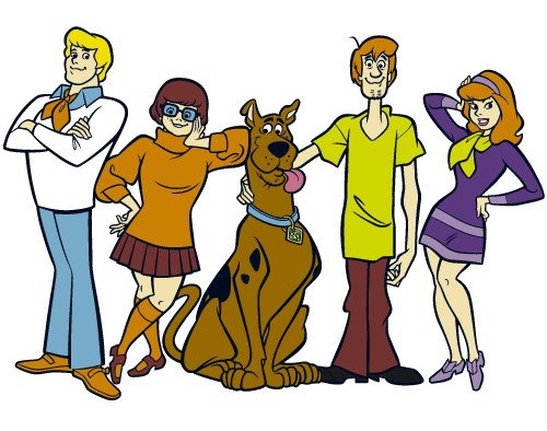
The character design in the 1986 version of the Hunchback of Notre Dame looks like Scooby Doo knock-off, we all know it and we all think it.

Scooby Doo Characters
They have the same basic look with the same black soulless eyes that are the same basic shapes as the Scooby Doo Characters. Esmeralda has Daphne-like eyes and everyone has the same shape But why is that? Did Scooby Doo and this version of the Hunchback have the same person in common? That was my thought because they look too damn similar but no, they don’t have anyone in common.

Gringoire
Scooby Doo was done by Hanna Barbera and started in 1969. The 1986 version of Hunchback was done by Burbank Films Australia. The animation directors were Warwick Gilbert and Geoff Collins. Both of them have worked for Disney, Gilbert worked on some the TV shows and the sequel movies (shudders) and Collins does timing stuff including the timing on the Disney Version of Hunchback. So they are not to blame for the look. The story broad artist was Richard Slapczynski but again he doesn’t seem like he was reasonable for the Scooby look. I can’t find some one to blame but it’s not a question of who but what.

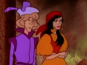
Esmeralda and Gringoire
Burbank Films Australia is to blame! They began in 1982 and they just made TV movies and directed-to-video animated movies based on classic literature and stories. 1986 was a busy year from them as the churned out seven movies that year, Hunchback was their second of the year after The Three Musketeers. Also this movie debuted on TV. They clearly made their films as quickly as they could so the animation and character design suffered a lot not to mention the story and script, this is making sense now. The style may have been influenced by Scooby Doo as it’s very popular but it was probably for more for efficiency sake than artistic intent.

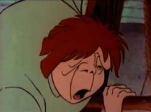
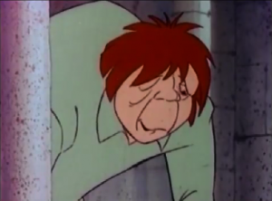
1986 Quasimodo
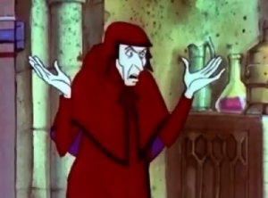
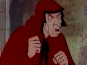
As it stands the character design is bland and uninspired. They look very simple and anything interesting about them is just baffling, like Frollo in red. Why? Much like their personalities their looks are watered down and boring.
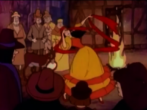
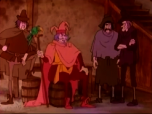
I will give it a little credit, they make the character look like the character they are depicting. It’s not a great compliment, but Esmeralda and Phoebus are pretty, Gringoire looks like a hapless wimp, Frollo is austere if still in red, Quasimodo has a kindly expression and Clopin fits the part, remember in the Jetlag version when Clopin looked like a monster. It’s a small thing that the design for the characters but in this sort of movie made by company that just spat out movies one after after another, it’s something but then again you except characters to look the original characters so it’s really not much of a compliment.

Clopin with thin legged extras
And when you really compare Scooby Doo and this version, the similarities are only in the eyes and faces. The Scooby Doo characters have more variety of shapes to their bodies. The characters in the 1986 Hunchback have thin stick-legs legs and larger torso. There is some variation but that is pretty much the going look of the characters.

Frollo
If Burbank Films Australia put more time into the execution of the character designs it would have been so much better then again if they had tried in any aspect of the film it would have been better and we would have had a great animated adaptation of The Hunchback of Notre Dame instead just the simple utilitarian version that this movie is.
Next Time – The Animation……….. -_-

Esmeralda Dancing
, it’s bad. Much like the character design it’s dull and uninspired.

