Esmeralda Other Burbank Hunchback of Notre Dame picture image

Esmeralda

I feel like I’m in some weird ring of hell. A Ring of Hell where my sole torture is rewatching this version of Hunchback. I can’t tell you in how many ways I just loathe this version and it’s not even in a logical, it’s visceral, it strikes me down to my core. I hate everything about this version and it hurts my soul in so many ways that I’m not sure I can quantify anymore why it’s a puke stain on the already dirty carpet of Hunchback version aimed at children. I think the main reason I can’t articulate why it’s terrible is because it has the same problems as every other  Disney knock-off versions, at this point it’s a case of “second verse same of the first.”  Everything is just the worst but you came here to read something that in some way resembles a review or you just click on a picture or you’re lost and have already clicked away but whatever the case the subject line has spoken and it’s not even trying to be clickbait so let’s get this over with.
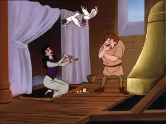
Esmeralda and Quasimodo, Other Burbank Hunchback of Notre Dame 1996 picture image

Esmeralda and Quasimodo,

As is standard with these knock-off Disney direct to video movies the animation super low budget. The use of repeat animation for extras to pad out the run time is beyond annoying and I might not have minded it so much if the movie didn’t start that way. It takes nearly three minutes to get to Esmeralda awkwardly dancing about, three minutes of just nothing but random town’s people laughing and clapping on repeat.  In addition to animation being stilled, awkward and mostly on repeat  most of the shots are at flat angles.  There is nothing interesting or memorable about the way the shots are composed to even hold a remote sense of attention.
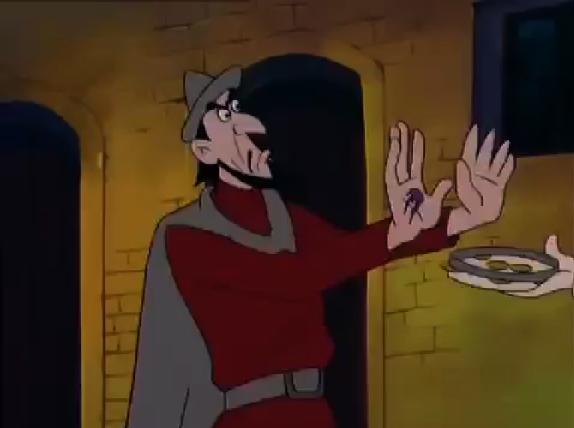
 

Frollo Other Burbank Hunchback of Notre Dame picture image

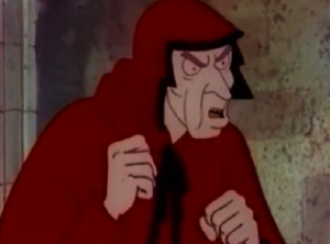
Frollo

But again I’m not done, though I wish I was, this will never end. There is the color design of this thing. If you think I was joking about calling this movie being like puke you were wrong. The color this movie most likes to use is a weird dark yellow color that resembles vomit. They also use a  green that looks like another shade of puke. I’m not kidding this movie has an ugly and all-round unpleasant color palette. If they were trying I guess they were trying to make it warm but they failed, they failed hard.
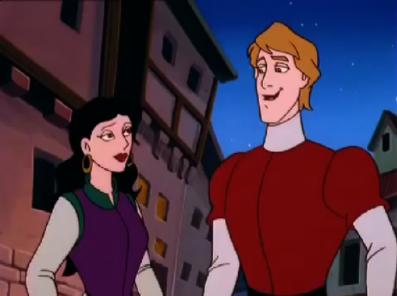
Esmeralda meets Phoebus Other Burbank Hunchback of Notre Dame picture image

Esmeralda meets Phoebus

Then there is the character design. Can you believe I didn’t really touch in the character designs yet? Both Phoebus and Esmeralda are drawn to be the prettiest that the shitty animation will allow. This of course gives them no visual interest so being “beautiful” by this movie’s standard is a mute point. Though the best line in this movie is Frollo describing Esmeralda’s eyes as “shining brighter than the most beautiful stars in the night sky.”  Too bad they don’t.
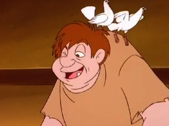
Quasimodo Other Burbank Hunchback of Notre Dame picture image

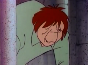
Quasimodo with his doves

Quasimodo is your typical cute, nice, deformed design that you see over and over again. He is very bulbous and round making him “cute.” Which is like standard in character design round is good and angles are bad.
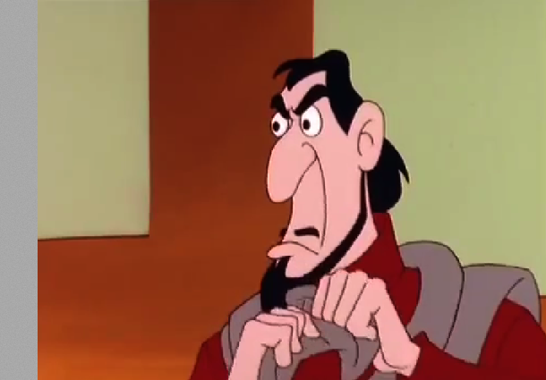
Frollo Other Burbank Hunchback of Notre Dame picture image

Frollo

Speaking of angles there is Frollo. And he is yet another case of “second verse same as the first. Agian he looks like a mix of Disney Gaston and Jafar. Why? Who are they even coping at this point? This  is like the third Frollo to look like this? He doesn’t look like either Disney Frollo or the 1939 version.  Is this a case of parallel thought between three stupid Disney Knock-off versions, where they combined  two popular Disney villains or did this version copy Secret of the Hunchback of Enchanted Tales? Both options scream laziness.  Though to be fair this version did take Frollo’s design beyond merely combining Gaston and Jafar and instead cross that combination with a fish.   
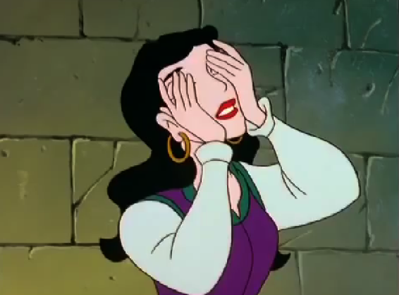
             

Esmeralda Other Burbank Hunchback of Notre Dame picture image

Esmeralda

This version is just entirely forgettable with its abysmal animation, boring flat angles, cringe-inducing color palette and lazy character design.  The only thing I can recall about this movie is how forgettable this version is and that is why I have to rewatch it thus prolonging the torture of the ring of hell I now occupy.

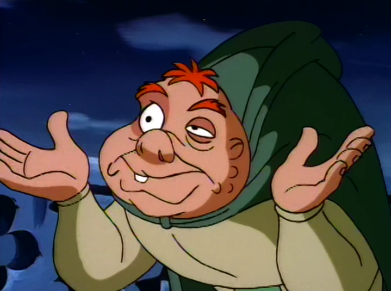
Quasimodo is just being Quasi The Secret of the Hunchback picture image

Quasimodo is just being Quasi

So here we are again, discussing other low budget cash grab off Disney’s Hunchback that has character designs that are derivative to Disney’s Beauty and the Beast as well Aladdin. It would be hilarious if it wasn’t so pathetic.

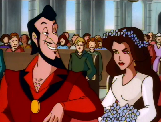
Frollo and Esmeralda's wedding The Secret of the Hunchback picture image

Frollo and Esmeralda’s wedding

Compared to the Enchanted Tales version, the character design in this version is marginally more preferable. At least with this version’s Quasimodo isn’t some sad pretty boy, he looks as Quasimodo should look even if his hunch is angel wings. The other characters look their parts except Frollo who as I have mention before on his character review looks like Gaston and Jafar’s love child. Gotta wonder if they read the book or at least watched the 1939 version, my guess is no to both.

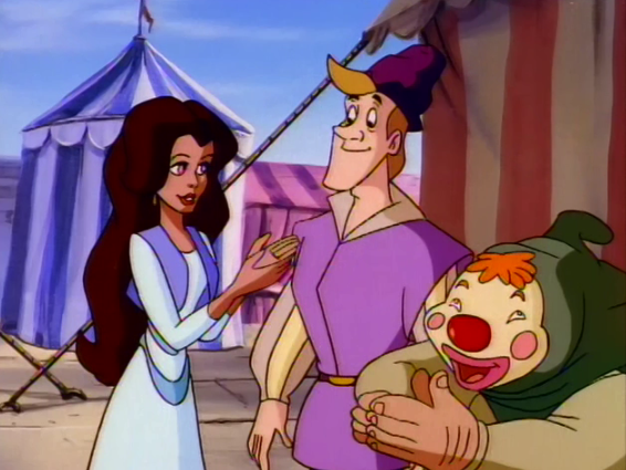
Esmeralda with Pierre and masked Quasimodo The Secret of the Hunchback picture image

Esmeralda with Pierre and masked Quasimodo

Also the character design in this version as compared to Enchanted Tales looks more cartoon-y, as in they went for more humorous designs instead of trying to make the characters pretty, and failed. Given the humor and how the Enchanted Tales version is misguided and stupid, the  humorous goofy look is better but on the whole the designs are not good.

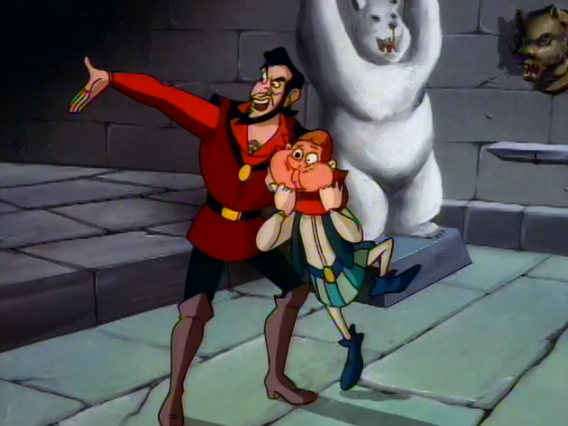
Frollo and his goon The Secret of the Hunchback picture image

Frollo and his goon

As far as the animation goes, there are Hunchback versions that at worse, so much worse, like hellishly worse and of course on the other end there is Disney movie.  The  Secret of the Hunchback looks more akin to a low-budget saturday morning cartoon. It’s fine giving the amount of money and effort they put in but no one is watching it for its art style.

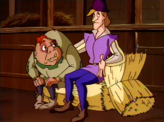
Quasimodo and Pierre The Secret of the Hunchback picture image

Quasimodo and Pierre

There is nothing special about The Secret of the Hunchback’s look and animation. It’s passable but only barley.

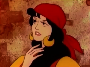
Esmeralda 1986 Hunchback Notre Dame picture image

1986 Esmeralda

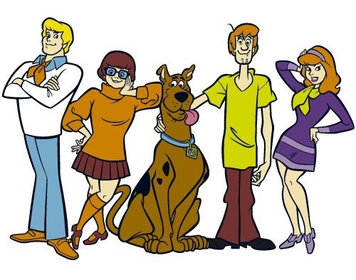
The character design in the 1986 version of the Hunchback of Notre Dame looks like Scooby Doo knock-off, we all know it and we all think it.

Scooby Doo Characters picture image

Scooby Doo Characters

They have the same basic look with the same black soulless eyes that are the same basic shapes as the Scooby Doo Characters. Esmeralda has Daphne-like eyes and everyone has the same shape But why is that? Did Scooby Doo and this version of the Hunchback have the same person in common? That was my thought because they look too damn similar but no, they don’t have anyone in common.

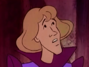
Gringoire 1986 Hunchback Notre Dame picture image

Gringoire

Scooby Doo was done by Hanna Barbera and started in 1969. The 1986 version of Hunchback was done by Burbank Films Australia. The animation directors were Warwick Gilbert and Geoff Collins. Both of them have worked for Disney, Gilbert worked on some the TV shows and the sequel movies (shudders) and Collins does timing stuff including the timing on the Disney Version of Hunchback. So they are not to blame for the look. The story broad artist was Richard Slapczynski but again he doesn’t seem like he was reasonable for the Scooby look. I can’t find some one to blame but it’s not a question of who but what.

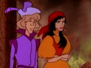
Esmeralda and Gringoire 1986 the Hunchback of Notre Dame picture image

Esmeralda and Gringoire

Burbank Films Australia is to blame! They began in 1982 and they just made TV movies and directed-to-video animated movies based on classic literature and stories. 1986 was a busy year from them as the churned out seven movies that year, Hunchback was their second of the year after The Three Musketeers. Also this movie debuted on TV. They clearly made their films as quickly as they could so the animation and character design suffered a lot not to mention the story and script, this is making sense now. The style may have been influenced by Scooby Doo as it’s very popular but it was probably for more for efficiency sake than artistic intent.

Quasimodo 1986 Hunchback Notre Dame picture image

1986 Quasimodo

As it stands the character design is bland and uninspired. They look very simple and anything interesting about them is just baffling, like Frollo in red. Why? Much like their personalities their looks are watered down and boring.

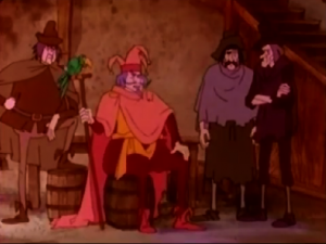
I will give it a little credit, they make the character look like the character they are depicting. It’s not a great compliment, but Esmeralda and Phoebus are pretty, Gringoire looks like a hapless wimp, Frollo is austere if still in red, Quasimodo has a kindly expression and Clopin fits the part, remember in the Jetlag version when Clopin looked like a monster. It’s a small thing that the design for the characters but in this sort of movie made by company that just spat out movies one after after another, it’s something but then again you except characters to look the original characters so it’s really not much of a compliment.

 Clopin with thin legged extras 1986 Hunchback Notre Dame picture image

Clopin with thin legged extras

And when you really compare Scooby Doo and this version, the similarities are only in  the eyes and faces. The Scooby Doo characters have more variety of shapes to their bodies. The characters in the 1986 Hunchback have thin stick-legs legs and larger torso. There is some variation but that is pretty much the going look of the characters.

Frollo 1986 Hunchback Notre Dame picture image

Frollo

If Burbank Films Australia put more time into the execution of the character designs it would have been so much better then again if they had tried in any aspect of the film it would have been better and we would have had a great animated adaptation of The Hunchback of Notre Dame instead just the simple utilitarian version that this movie is.

Next Time – The Animation……….. -_-

Esmeralda Dancing 1986 Hunchback Notre Dame picture image

Esmeralda Dancing

The Animation in Madeline is crap-poo. No, actually it’s worse. It’s not even bad enough to be delightful. No, it’s honest-to-god poo. But what makes it so bad besides every damn thing? Well, I will list three things because anymore analysis on this, is going to drive me to insanity.


#1 The Colors

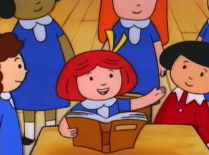
Madeline, Pepito and her friends read Hunchback of Notre Dame picture image

Madeline, Pepito and her friends read Hunchback of Notre Dame


The Color design is dull. It tries to be bright and colorful but it meanders  in the dull. Honestly I could take the colors  as the tones aren’t awful and the gradient are ok but the  dumb character design ruin it,  which brings me to me second point;


#2 The Character Design

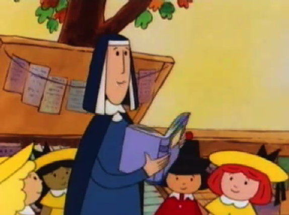
Ms. Cavell holding The Hunchback of Notre Dame, Madeline and the Hunchback picture image

Ms. Cavell holding The Hunchback of Notre Dame


The Character Designs are flat, uninteresting and dumb. Sure they look like the books but while the books were endearing the character look stupid. With their cold soul-less black dot eyes, their blocky bodies  and there unvaried faces. They just look stupid in motion. Then we come to the problem real issue;


#3 The Laziness


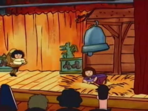
Madeline or Pepito as Quasimodo  picture image

Madeline or Pepito as Quasimodo

The animation in Madeline is abject, unfiltered, pure  laziness.  Anything that could be good and endearing is trashed by the immense awfulness of the animation. The character’s motion are stilted and awkward. The repeat animation is laughable. The use Pepito as Madeline in a long shot which make it a continuity error. I’m sure this show has a LOT of them. There are dozen upon dozen still frames to pad out the ghastly time. They also you a dissolve transition to get the girls to turn at the end while they are brushing their teeth. Also that is another continuity error since it has the girls in their “magnificent” day clothes but the shot before that they were in their nightgowns. So much laziness in this show.


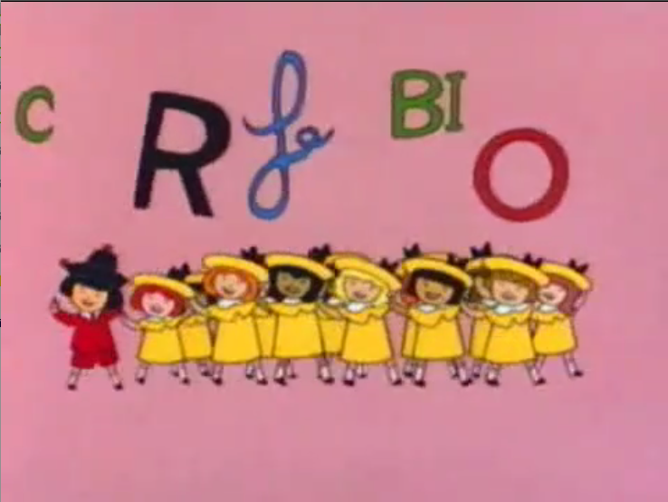
Madeline and her dumb song hunchback of Notre dame

Madeline and her dumb song

The animation in Madeline is one of it’s biggest failures. it hard to really get passed the crappy animation. I mean one could if the story and characters were interesting but they are not so the bad animation is really inexcusable.  It really is just crap-poo.


Next time – The Moral of the Story

Pepito and Gerald Dippetty Doo, Madeline and the Hunchback picture image

Pepito and Gerald Dippetty Doo