Congrats, you’re getting married and have decided that you don’t want to be content being any old Hunchback fan. No, you want your wedding to a Hunchback of Notre Dame themed wedding and I hate to break it to you, but it’s not a popular choice, there isn’t a pinterest board going to help you plan your affair.

But that is where thehunchblog wedding theme month comes in and offers you a hand. So let’s start these wedding idea posts with a good jumping off point, COLOR SCEME! Can I get a Yay?

Regardless of theme, weddings typically have a color scheme. At their most simple, they are two colors used to dictate the decor of the wedding. Though you can have more than two but you don’t want too many colors.

Dark Green and Light Grey Wedding Ideas picture image

Dark Green and Light Grey Wedding Ideas

For a Color Scheme, I would suggest looking toward Notre Dame herself. You can either go with soft grey or that creamy stone color. Both colors are very Parisian, I know this because I saw it on pinterest. You might want to consider adding a green tone for Esmeralda’s namesake, get both the Notre Dames in there.

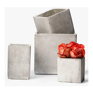
Concrete Square Vases picture image

Concrete Square Vases

For center pieces you might want to consider something with bells because what is Hunchback without bells. You could also again take inspiration from Notre Dame, maybe with concrete vases or something. You might to keep things square as Notre Dame as a square like shape.

I wouldn’t go with gargoyles, they tend to be used for gothic affairs, and while Notre Dame is the prime example of Gothic architecture it’s the other type of goth style, unless of course it’s part of your vision.

Goat Cheese, Apple and Bacon Canapés are made special with Eggo Buttermilk Pancakes picture image

Goat Cheese, Apple and Bacon Canapés are made special with Eggo Buttermilk Pancakes

And remember you might want to consider incorporating Esmeralda’s and Gringoire’s wedding feast into some part of the meal as a clever nod to the book. They had Bacon, Apples, Rye bread and Beer. It might seems like elegant food but you can also make it more fancy, if you want.

*Disclaimer*- thehunchblog know nothing about wedding planning. These posts are for entertainment purposes only, at least I hope they are entertaining.

The Animation in Madeline is crap-poo. No, actually it’s worse. It’s not even bad enough to be delightful. No, it’s honest-to-god poo. But what makes it so bad besides every damn thing? Well, I will list three things because anymore analysis on this, is going to drive me to insanity.


#1 The Colors

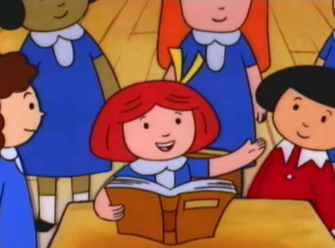
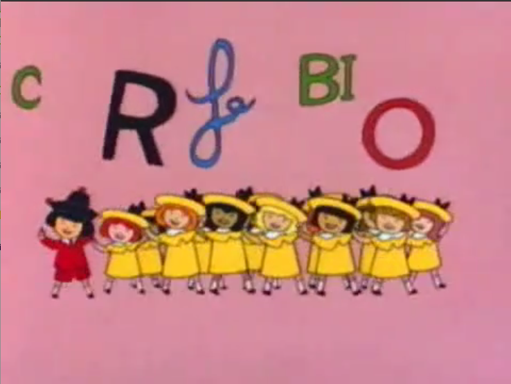
Madeline, Pepito and her friends read Hunchback of Notre Dame picture image

Madeline, Pepito and her friends read Hunchback of Notre Dame


The Color design is dull. It tries to be bright and colorful but it meanders  in the dull. Honestly I could take the colors  as the tones aren’t awful and the gradient are ok but the  dumb character design ruin it,  which brings me to me second point;


#2 The Character Design

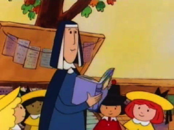
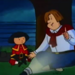
Ms. Cavell holding The Hunchback of Notre Dame, Madeline and the Hunchback picture image

Ms. Cavell holding The Hunchback of Notre Dame


The Character Designs are flat, uninteresting and dumb. Sure they look like the books but while the books were endearing the character look stupid. With their cold soul-less black dot eyes, their blocky bodies  and there unvaried faces. They just look stupid in motion. Then we come to the problem real issue;


#3 The Laziness


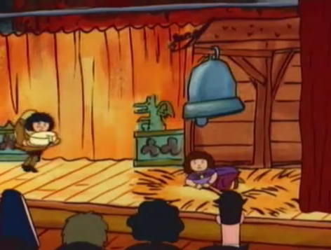
Madeline or Pepito as Quasimodo  picture image

Madeline or Pepito as Quasimodo

The animation in Madeline is abject, unfiltered, pure  laziness.  Anything that could be good and endearing is trashed by the immense awfulness of the animation. The character’s motion are stilted and awkward. The repeat animation is laughable. The use Pepito as Madeline in a long shot which make it a continuity error. I’m sure this show has a LOT of them. There are dozen upon dozen still frames to pad out the ghastly time. They also you a dissolve transition to get the girls to turn at the end while they are brushing their teeth. Also that is another continuity error since it has the girls in their “magnificent” day clothes but the shot before that they were in their nightgowns. So much laziness in this show.


Madeline and her dumb song hunchback of Notre dame

Madeline and her dumb song

The animation in Madeline is one of it’s biggest failures. it hard to really get passed the crappy animation. I mean one could if the story and characters were interesting but they are not so the bad animation is really inexcusable.  It really is just crap-poo.


Next time – The Moral of the Story

Pepito and Gerald Dippetty Doo, Madeline and the Hunchback picture image

Pepito and Gerald Dippetty Doo

Like most of the other elements in the Jetlag version of The Hunchback of Notre Dame the animation is just lazy. But more than that it’s dull and joyless.

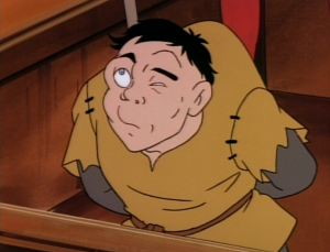
Quaismodo Jetlag The Hunchback of Notre Dame picture image

Quaismodo Jetlag The Hunchback of Notre Dame

First, the colors. They’re dull and muddy. If it was meant to be stylistic, it failed but I don’t think it was. I think the color story was done quickly and without much thought.

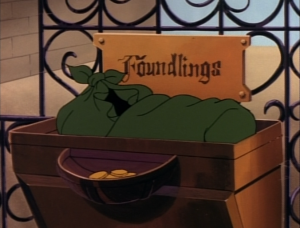
Baby Quaismodo, Jetlag Hunchback of Notre Dame   picture image

Baby Quaismodo, Jetlag Hunchback of Notre Dame

Second, the repeat animation. Quite often in this movie the animation will repeat frames of animation for what seems like an eon. It does this because it has to padded out the story. The movie also does this with still frames. The effect of this method is sheer boredom. It’s almost painful to have to sit there a watch baby Quasimodo wiggling around for a few seconds.

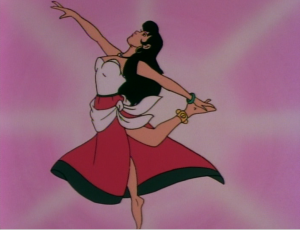
Esmeralda twirling, The Hunchback of Notre Dame, Jetlag picture image

Esmeralda twirling, The Hunchback of Notre Dame, Jetlag

Three, the movement of the characters. It’s awkward, weird and sort of jolty. Nothing looks smooth or fluid. Also the lip sync is bad. It gets very annoying. In fact at one point Fleur de Lys is talking but nothing in coming out of her mouth. This could be the dub cutting dialogue or repeat animation. Take your pick, either choice is the result of laziness.

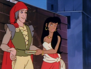
Esmeralda and Gringoire Jetlag version Hunchback of Notre Dame picture image

Esmeralda and Gringoire

More than that the screen composition and framing is just really dull and not interesting to look at. It just feels lazy, rushed and joyless which just further the boredom that this movie brings on.

Tormented Frollo Jetlag Hunchback of Notre Dame picture image

Tormented Frollo Jetlag Hunchback of Notre Dame

The animation is just so soulless. There is not joy or style in it and it really makes the movie feel so much longer that 40 minutes.

Next Jetlag Article – Plot Adherence

Esmeralda & Phoebus Kiss while Frollo attacks Jetlag version Hunchback of Notre Dame picture image

Esmeralda & Phoebus Kiss while Frollo attacks