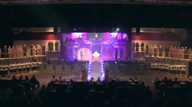
Full Stage view during the Bells of Notre Dame King's Academy Hunchback of Notre Dame picture image

Full Stage view during the Bells of Notre Dame King’s Academy Hunchback of Notre Dame

The stage that the King Academy used for their production of The Hunchback of Notre Dame is divided into a few parts. The lowest level is used for dance number and one could say it represents the streets of Paris and a few of the principle cast use this level. Then there is a ramp to the next level with is sort of like Sanctuary of Notre Dame as well as other setting like Square of Notre Dame. Then you have the upper most level which is the Bell tower. There is also the sides which the ensemble uses but Esmeralda appears there during the Esmeralda song.

At first I thought the fact that most of the action takes place at the upper level would impede the viewing experience for an audience but I think I was wrong. From a video vantage point that could be true, if you are watching it from the camera’s angle but just in a wide shot the action in the bell tower would look remote. However from the audience they would be able to see the action clearer as they have to look up and there would nothing to block their view. I sort of recall seeing a play that had a similar height presentation and I’m pretty short so it worked out for me.

Otherwise the staging is fairly straightforward there are not too many surprises, a character sings and they pretty much stand still while the ensemble does a little choreography while singing and the dancers dance at the lowest level. Well, there was one surprise, the gargoyles are suspended and swing around a little bit but still pretty much in one spot but it was a nice touch.

Also before I end this, the Notre Dame set was really great.

Esmeralda (Gina Lollobrigida) and Quasimodo (Anthony Quinn), 1956 Hunchback of Notre Dame picture

Esmeralda (Gina Lollobrigida) and Quasimodo (Anthony Quinn), 1956 Hunchback of Notre Dame

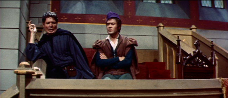
Let’s talk about the direction of the 1956 version of Hunchback of Notre Dame and its complete lack of style. So what do I mean when I say lack of style. I mean the angle of the framing or the camera angles. Almost every single shot in this film has exactly the same angle:  straight-on or flat angles. Straight-on  angles have their place in cinema but when nearly the entire film in made up of them it get  very, very,  very dull. Every now and then they do a shot-reverse-shot (two people talking) but even that is considered boring.  This movie doesn’t hide the fact it was shot in the most efficient way possible. It was most likely shot this way because they shot it twice, a French version and an English version. This dual version prove detriment to the final product as it’s an 1 hour 49 minutes of straight-on angles with an occasion pan or zoom. It feel like they recorded a play and not a movie.

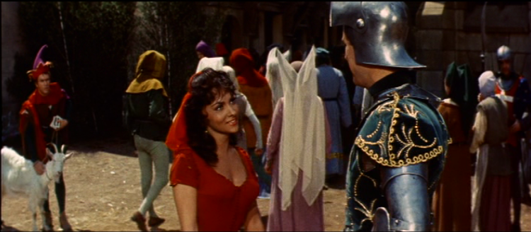
Esmeralda (Gina Lollobrigida) with Phoebus (Jean Danet), 1956 Hunchback of Notre Dame picture image

Esmeralda (Gina Lollobrigida) with Phoebus (Jean Danet), 1956 Hunchback of Notre Dame

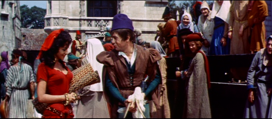
The flat-angle also making the blocking and composition insanely dull as well. Also the editing rarely cuts away from the medium long shots.  So scene play out  with people talking and the camera sometimes panning to follow. Rarely does it cut to a close up or reaction shot.

Robert Hirsch as Gringoire & Gina Lollobrigida as Esmeralda, 1956 Hunchback of Notre dame picture image

Robert Hirsch as Gringoire & Gina Lollobrigida as Esmeralda, 1956 Hunchback of Notre dame

But for the sake of argument let’s look at the big scene of Hunchback, Quasimodo saving Esmeralda.

http://www.youtube.com/watch?v=Zxzj403ihYg&feature=youtu.be

This scene is usual big and epic is rather small and dull. But what really gets me is after Djali walks into the cathedral there is a dissolve which means a passage of time. This makes the big ‘sanctuary shot” feel like it was thrown in. I compare this to Disney

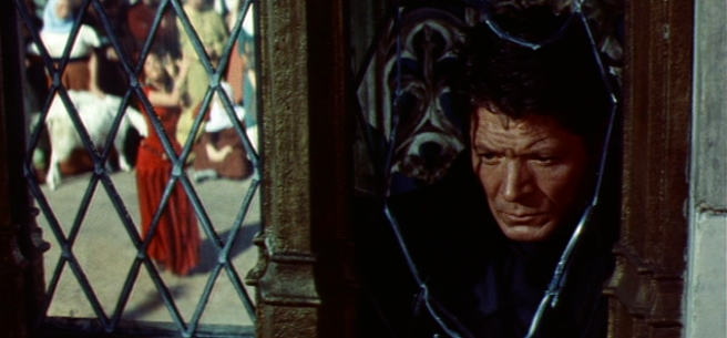
and its dullness is amplified. One can argue that the 1956 scene plays out like the book but there is no excuse for the all flat which steals the life away from any scene. However the film isn’t devoid of inserting camera work they just seem to be allocate to Esmeralda’s dance. The Angles again are mostly flat but the editing has a degree variety.  I think the most interesting single shot in the movie is Frollo staring at Esmeralda as she being reflective in the window next to him.

Frollo (Alain Cuny) stares while Esmeralda (Gina Lollobrigida) dances, 1956 Hunchback of Notre Dame picture image

Frollo (Alain Cuny) stares while Esmeralda (Gina Lollobrigida) dances, 1956 Hunchback of Notre Dame

All in all this film is made boring in it execution.  The framing, the editing, the composition of the shot are all so mind-numbingly dull.

Interior Set, 1956 Hunchback of Notre Dame picture image

Flat Angle, 1956 Hunchback of Notre Dame

Next 1956 post- an editing mistake.

Esmeralda (Gina Lollobrigida), 1956 Hunchback of Notre Dame picture image

Esmeralda (Gina Lollobrigida), 1956 Hunchback of Notre Dame