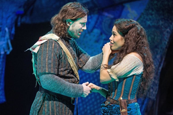
Ciara Renée as Esmeralda and Andrew Samonsky as Phoebus
On the whole, I like the costumes. There is a lot of good textures and colors that match the spirit of the Disney movie but elevates them to the stage. In particular, I really like Esmeralda’s main costume and Phoebus’ costume. While I don’t they are accurate to the actual historical times they don’t really have to be. Though I did look up Burgundian fashion/armor and Phoebus might not be too far off, but really it does matter. Esmeralda has a very good re-imaginaing of her Disney look. I find it a bit curious that her hip scarf is devore, which is a velvet that have treated so that fibers are burned away resulting in a pretty pattern. Kind of like this. I find it curious because I have longed suspected that Esmeralda’s original Notre Dame de Paris costume was done with a similar technique so is it an homage or coincidence? I think it’s a coincidence but I like to think it’s an homage.
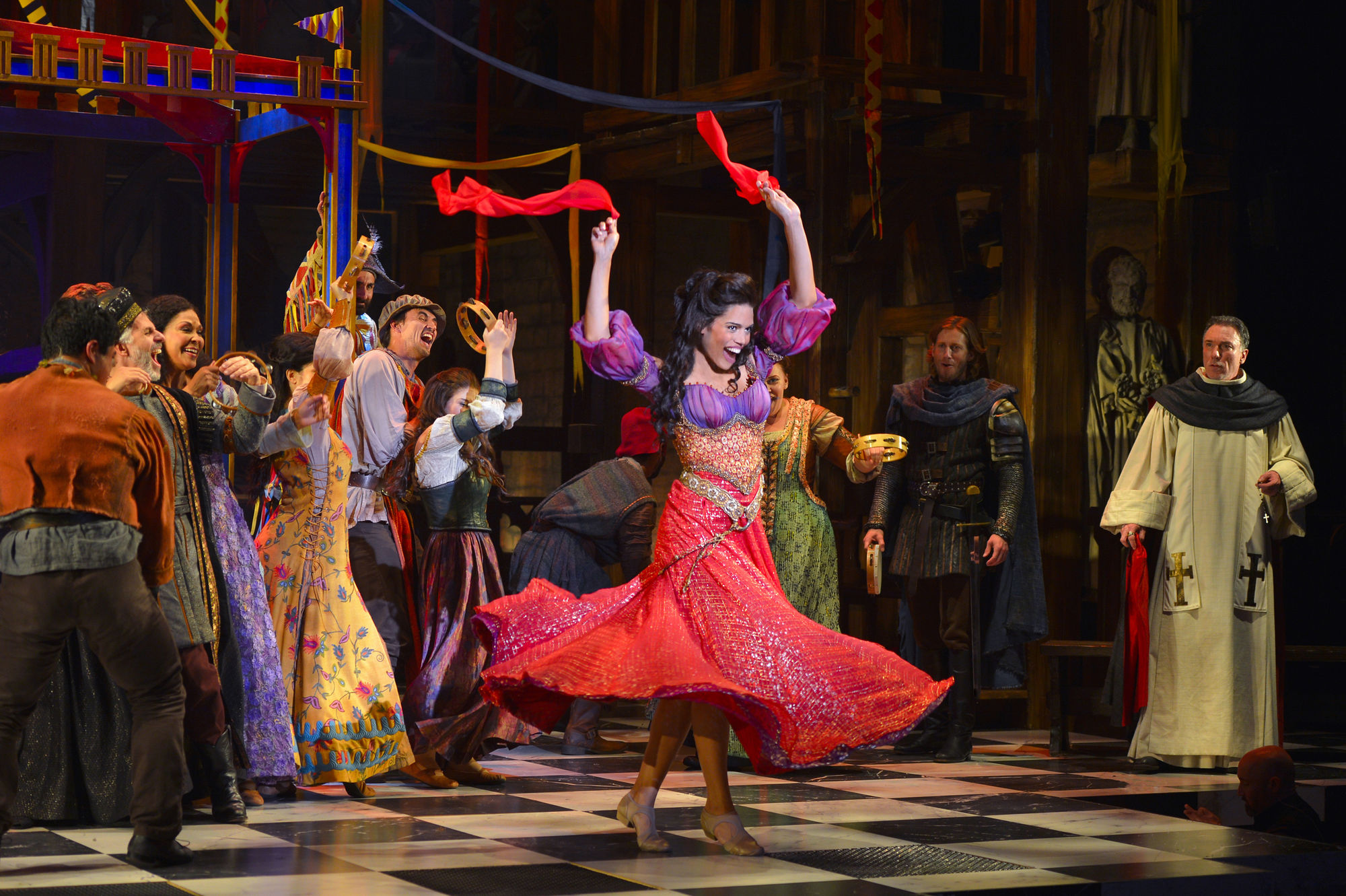
Ciara Renee as Esmeralda, Papermill production of Hunchback of Notre Dame
Her other costumes are fine too, though I get shade of Ariel’s seashell bra with her red dress in the bodice. Not a criticism, it just something I noticed.
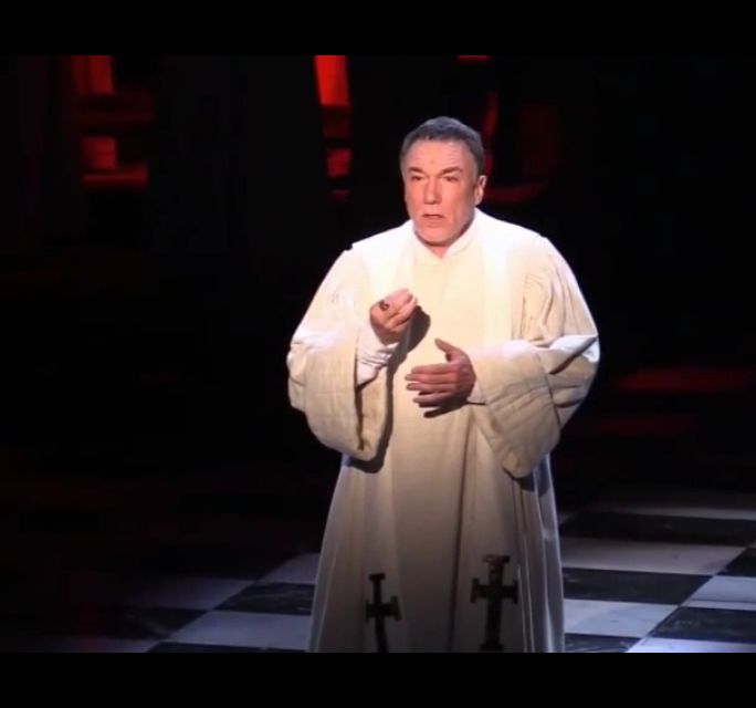
Patrick Page as Frollo singing Hellfire, Papermills
However there are aspects of the costume and make-up are I find to be lacking.
Let’s start with Frollo. Poor Frollo, I have not been kind to this version of him. First off Frollo gets like two costume changes. The black outfit he wears at the start before he takes his vows and during the curtain call. His other costume is his vestments which is his principle costume. He does also wear a black cloak when he goes to the bar. There isn’t so much as issue with his costume as does fit with his character and profession but they could have done more. His vestment is white with a black stole with a red lining and that is fine but they should made different stoles that cover more of the pure white robe as he falls deeper into lust because his lust was hardly ever communicated in his acting. Frollo is so cool in this version with minor bits of it here and there because the songs had the lines in the lyrics. Making his costume get a blacker as the show went on would have been a great little visual clue to his psyche as his lust consumes him.
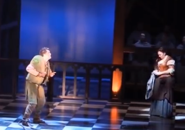
Michael Arden as Quasimodo performing Made of Stone
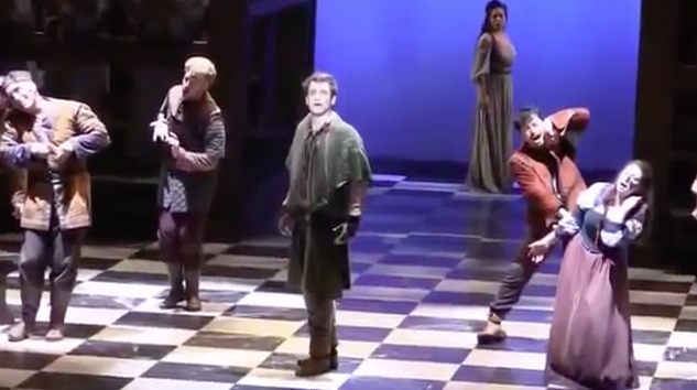
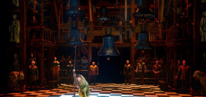
Kind of a similar issue I had with costumes functioning oddly was the congregation removing their cowls during Made of Stone. The idea was that that they were aspects of Quasimodo’s mind as well as personified in stone but because they actors are both the statues and people as other points in the show, taking off the cowl reads more of a costume change and they are going for the stones that are Quasmodo imaginary friends to regular towns people. I would have had them pull up the hoods of the cowls to hid their face i.e. losing the humanity Quasimodo gave them and fading into the darkness as soulless statues of stone. Not throwing off the cowl entirely. (sorry for the bad picture)
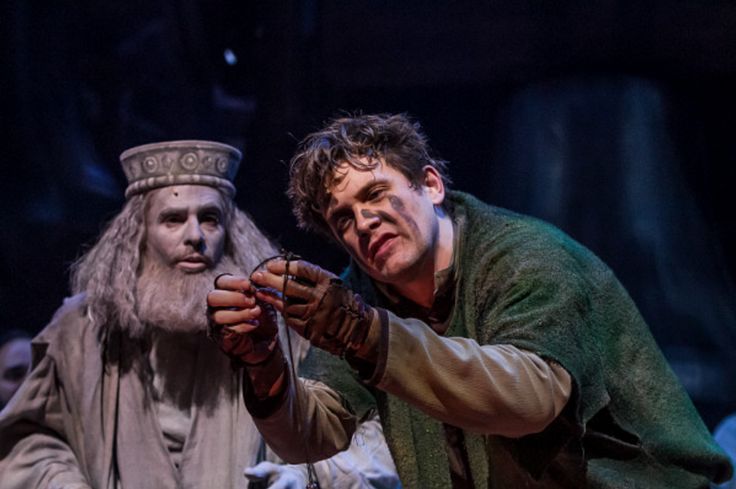
Michael Arden as Quasimodo with Saint Aphrodisius, Musical Production of Hunchback of Notre Dame
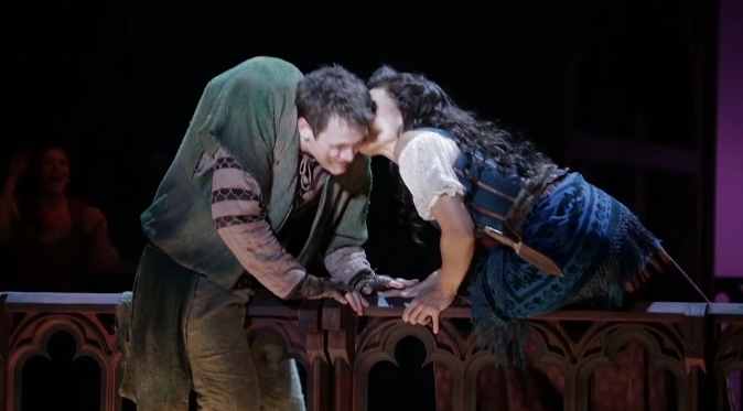
Hey speaking of Quasimodo, his make-up. I have so many issues with his make-up. I get what they were doing, they wanted to drive the point of what makes a monster and what makes a man by having the actor literally transform into Quasimodo on stage. This is a gimmick and it serves to make it seem like the audience wouldn’t get the point and ultimetly making the Disney movie more mature and taking it audience more seriously.
Also this is not a great transformation, the actor applies like two lines of face paint to his face and that is his facial deformity. Honesty, I don’t have a issue with making the make-up minimal and having the actor do more of the work to convey Quasimodo’s deformity, that is what Notre Dame de Paris did and they had a much more minimal of a style and they still be more lines on Quasimodo’s face, making that make-up more elaborate. Also it’s not super impressive from a stagecraft perceptive to have a grand set and lines for make-up for a character that is supposed to have facial deformity. Maybe had they added a little bit more to that real time transformation, like an eye protusion prothetic it would have been a little more impressive. Der Glockner’s make-up wasn’t anything amazing and yet it looks like the Phantom of the Opera comparatively but that wasn’t the point they wanted to be minimal, (or save on the make-up budget.)
The issue of “minimalism” is something that will get discussed in the next post but it seems like there is a solid disconnect of the make-up, the costumes and the sets. For the most part the sets and the costume go together fine. They are not what would considered overly grand and elaborate but they richly colored and textured but the make-up is minimal? It’s just weird especially for a character who is known for a facial deformity? That is like making the Phantom of the Opera’s deformirt look like a sunburn, oh wait they did that.
It was a decent thought for Quasimodo’s make-up but it was misguided and lacking in execution. It’s like they needed to pick a style and commit, not have aspects of the production to be one style and other aspects be another.
And remember you can still vote in the poll, so tell your friends.
What should be the next version?
- Quasimodo d'el Paris (53%, 9 Votes)
- The Dingo Version (35%, 6 Votes)
- Other (PLEASE say what it is in the comments) (12%, 2 Votes)
Total Voters: 17

